My projects,
in full
The challenge, the solution and the process behind each project
- 01Holdup AgencyWebsite
- 02MavimattCompany profile
- 03Legacy of GameBranding & Web3
- 04GustaGoBranding, social media & app design
- 05McDonald'sSocial media management
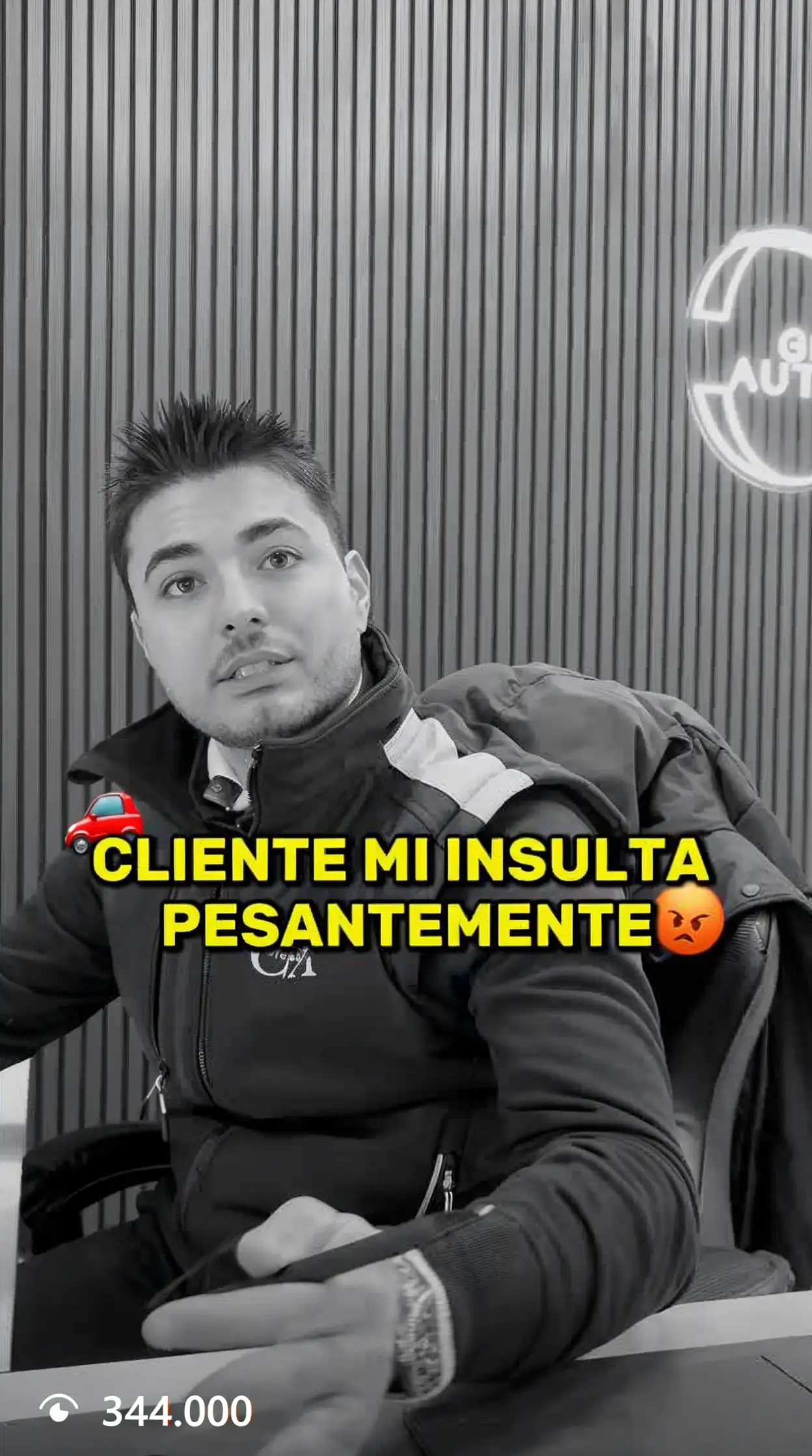
- 06Giacchi AutomobiliSocial media & branding
- 07Enei S.p.A.Corporate website
- 08MBP ProductionsWebsite
- 09Vista360Corporate website
- 10Prima SoluzioniSocial media & website
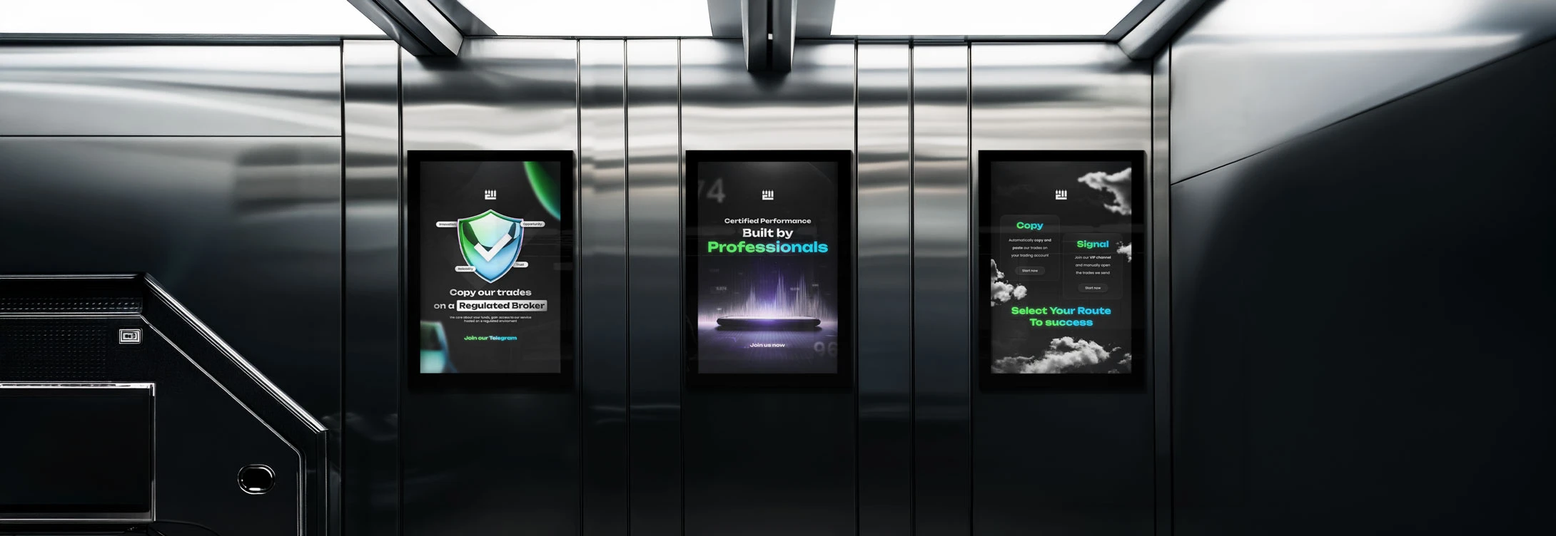
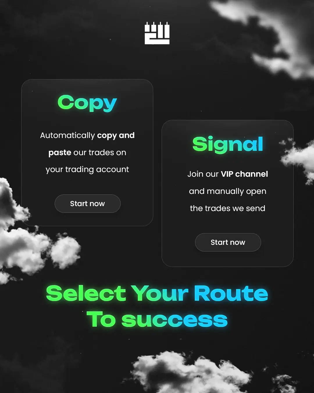
- 11The Trader ForgeBranding & social media
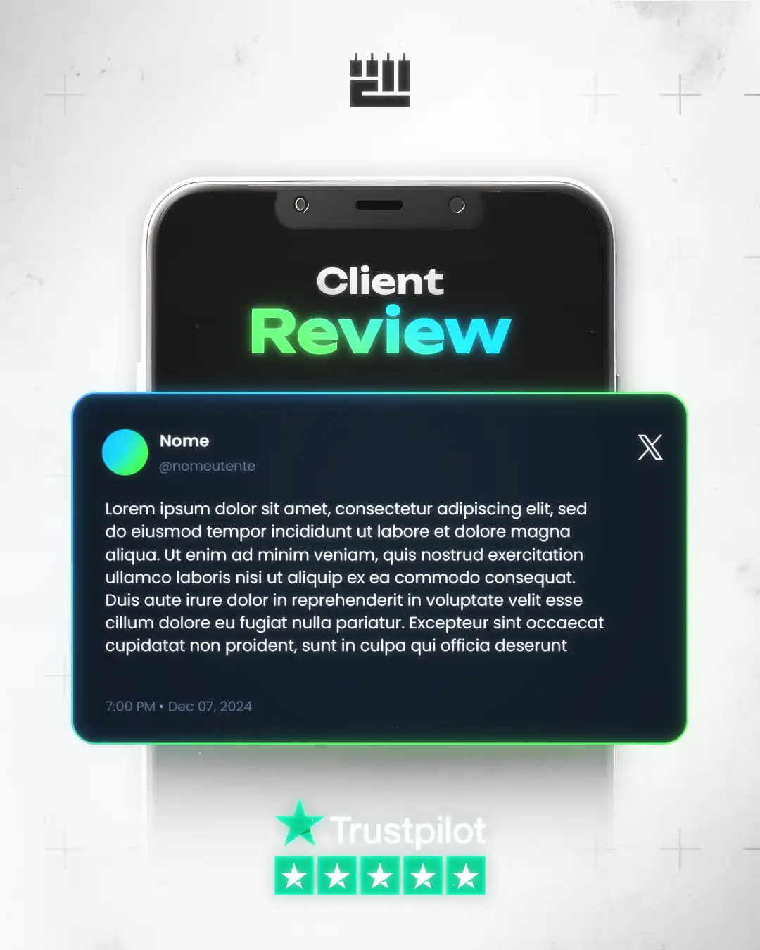
- 12Forex AikidoBranding & social media
- 13ZenithWebsite & UX/UI
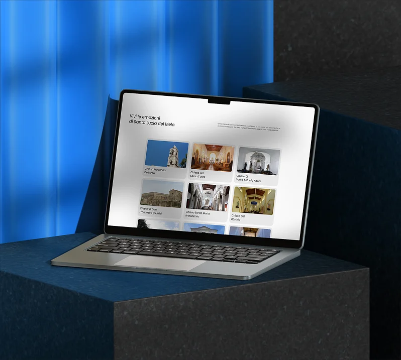
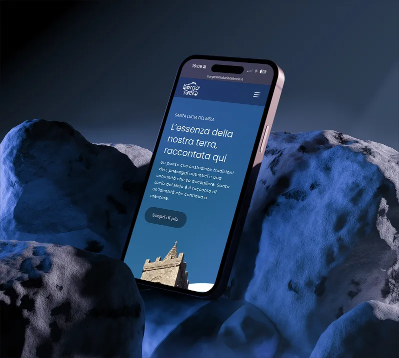
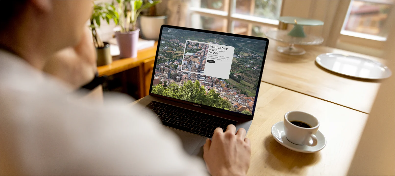
- 14Borgo SacroInstitutional website
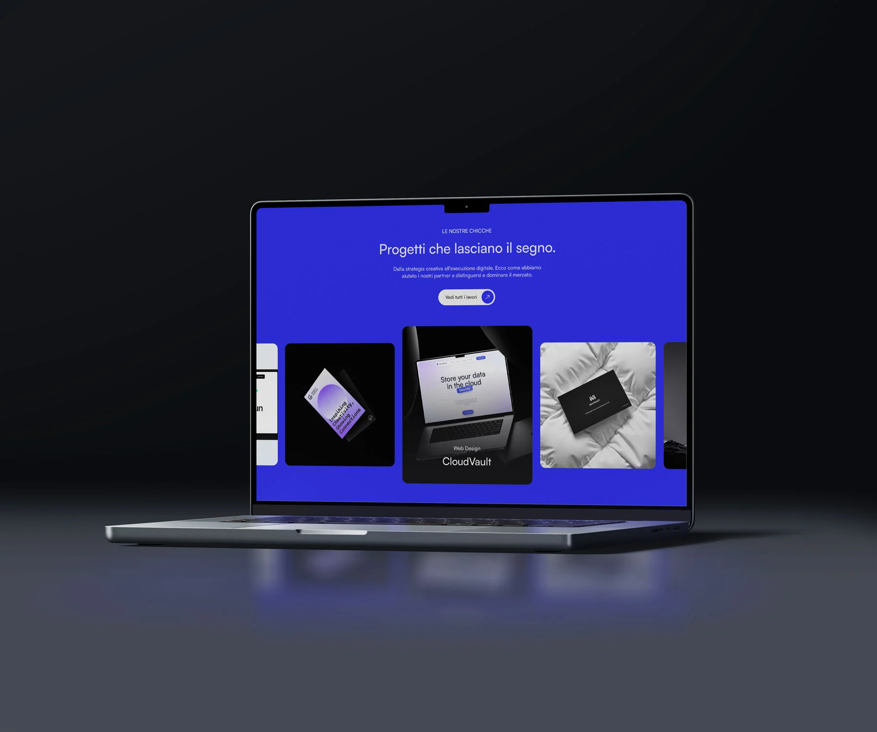
Holdup Agency
- Web design
- UX/UI design
- Copywriting
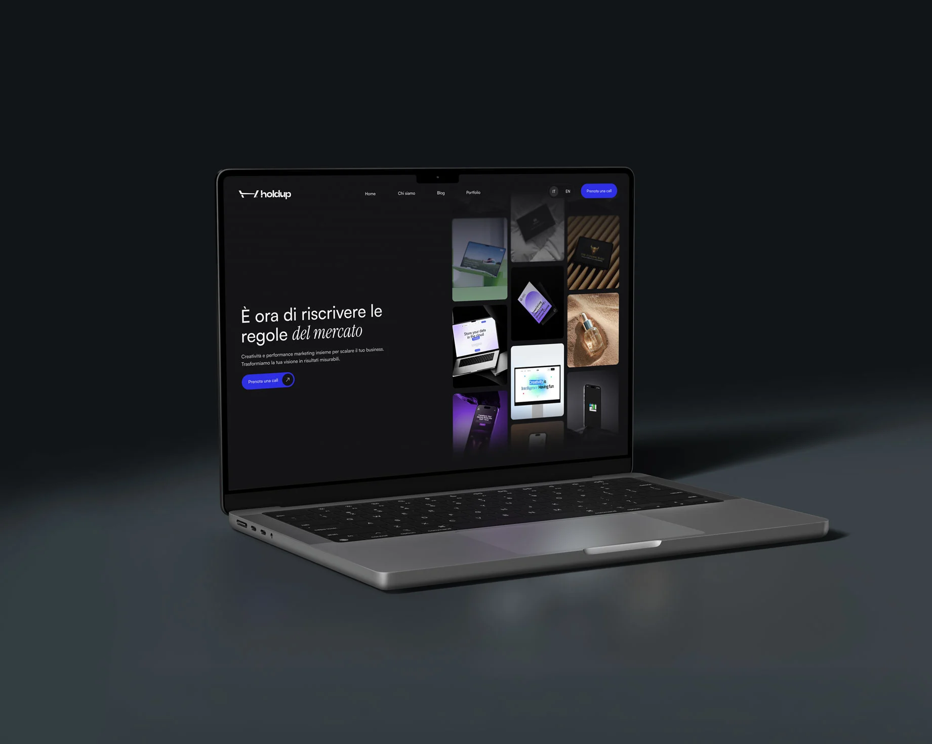
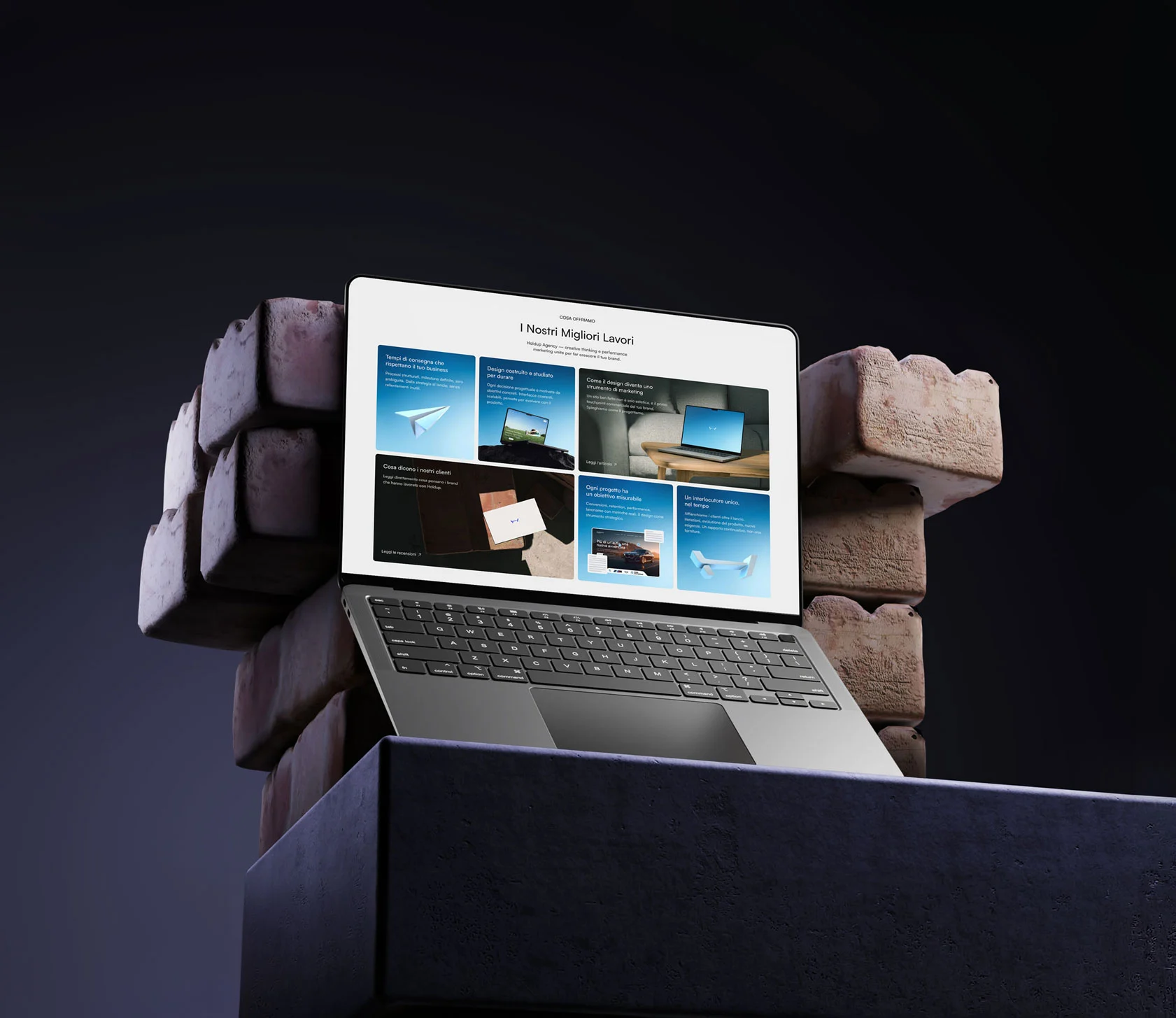
Holdup Agency is an Italian communication agency helping brands and companies define creative strategies, campaigns and identity. To tell their editorial, results-driven approach online, they needed a website worthy of the work they deliver for clients every day.

- Client
- Holdup Agency
- Industry
- Communication
- Services
- Web design
- Location
- Italy
Challenge
Standing out in a crowded landscape of creative agencies with a digital presence that wasn't just a portfolio, but a true manifesto of how they communicate: visual, precise, and capable of turning curiosity into concrete leads.
Solution
We designed and developed a website with a clear narrative architecture, a design system aligned with the brand and a fluid experience guiding visitors from discovering the studio to getting in touch, letting the visual tone speak before the words.
- 01Discovery
Briefing
Brand analysis
Roadmap
Moodboard
- 02Strategy
Target definition
Content architecture
Wireframes
User flow
- 03Design
UI design
Components
Responsive
Visual identity
- 04Development
Development
Optimisation
Testing
Delivery


Mavimatt
- Brand identity
- Visual identity
- Printed media
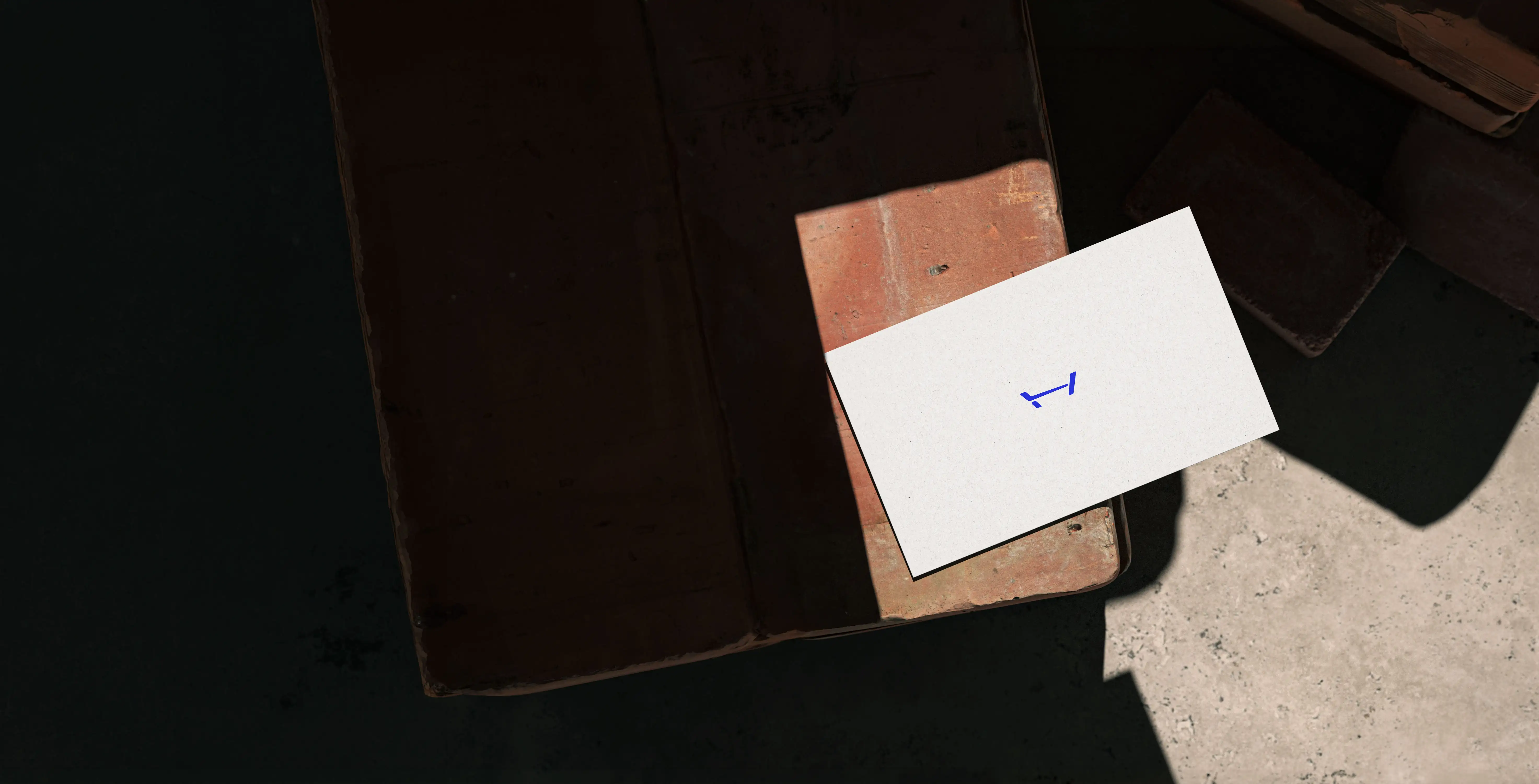
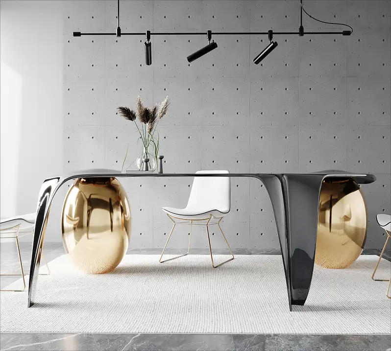
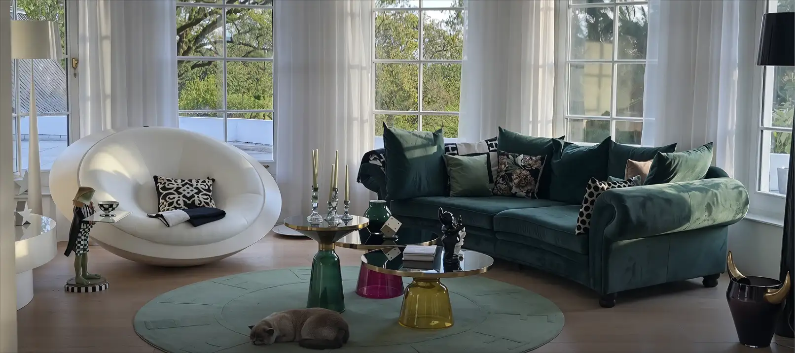
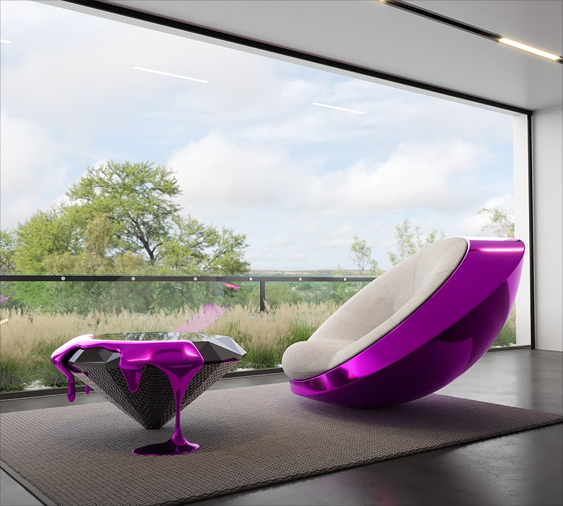
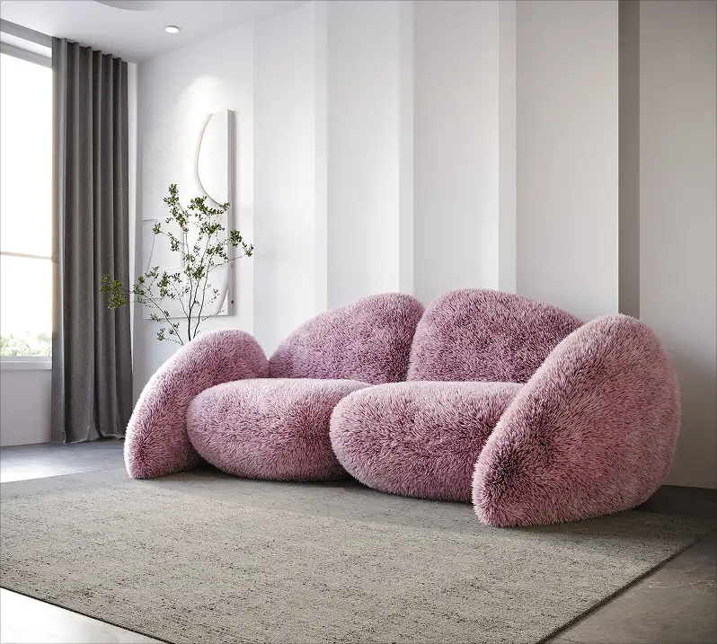
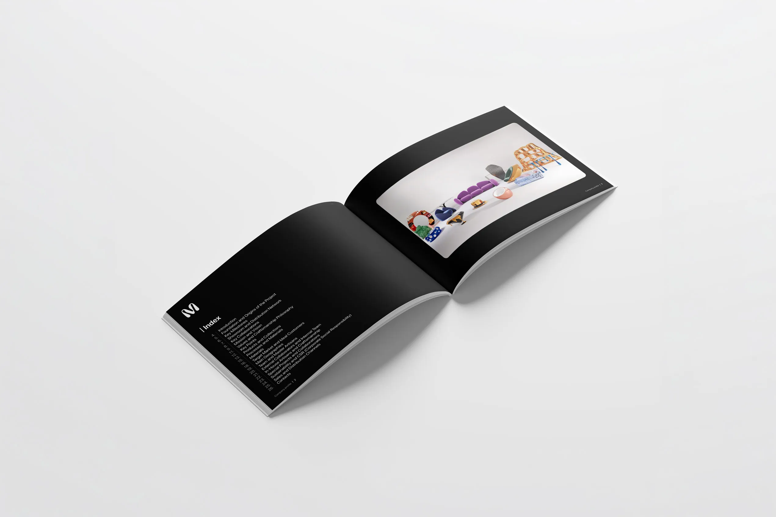
Mavimatt is an Italian luxury furniture brand with pieces entirely handmade and distributed worldwide. To communicate this level of excellence to partners and international buyers, they needed a company profile worthy of the brand, not just any document, but a strategic tool.

- Client
- Mavimatt
- Industry
- Interior design
- Services
- Branding and design
- Location
- Italy
Challenge
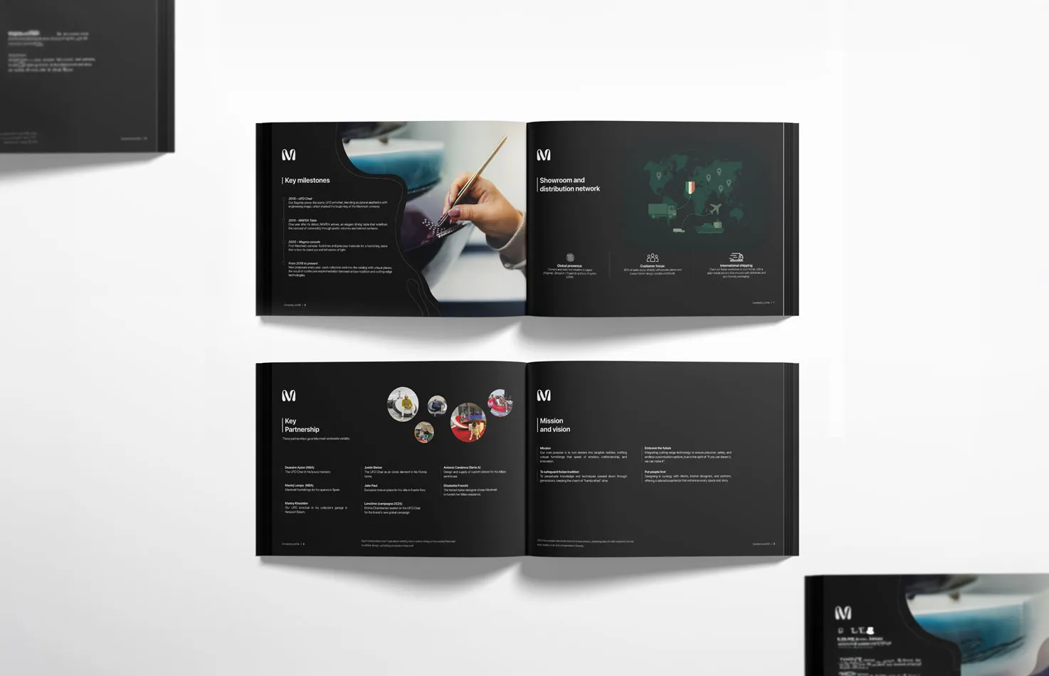
Translating the identity of a brand built on visual emotion and craftsmanship into print, without losing the aesthetic strength that sets it apart globally, while staying consistent with an established and instantly recognisable visual identity.
Solution
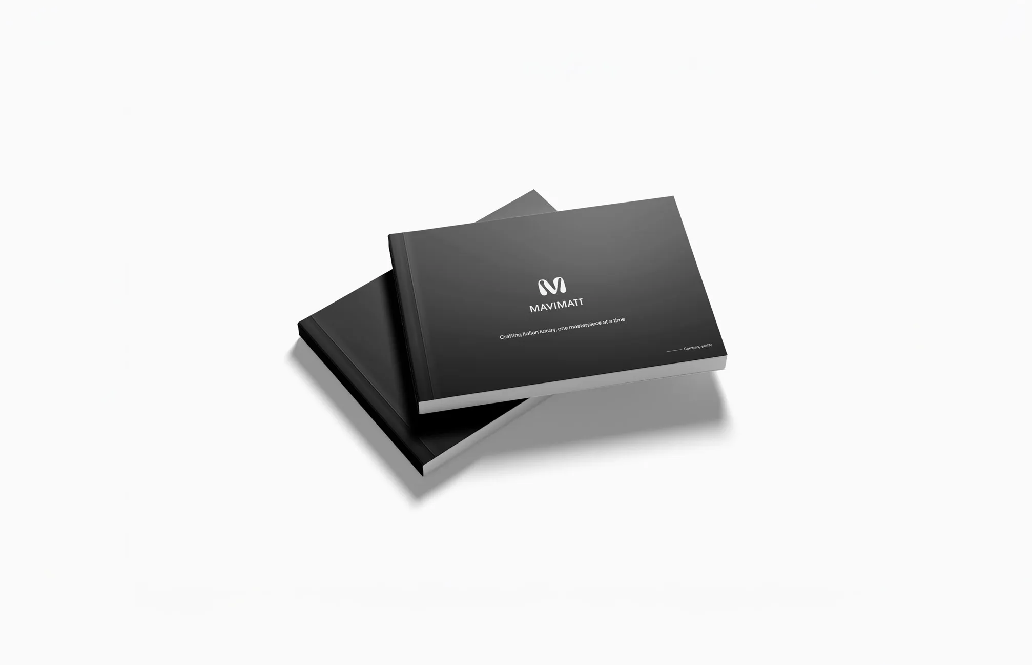
We integrated Mavimatt's visual identity into every element of the company profile, from typography to content hierarchy to image selection. The result is a document that represents the brand with the same care as a design piece.
- 01Discovery
Briefing
Brand analysis
Roadmap
Moodboard
- 02Strategy
Content definition
Narrative structure
Benchmarking
Positioning
- 03Design
Layout
Typography
Visual identity
Image selection
- 04Delivery
Final review
Print export
Digital format
Asset delivery


Legacy of Game
- Project management
- Branding
- 3D design
- Web design
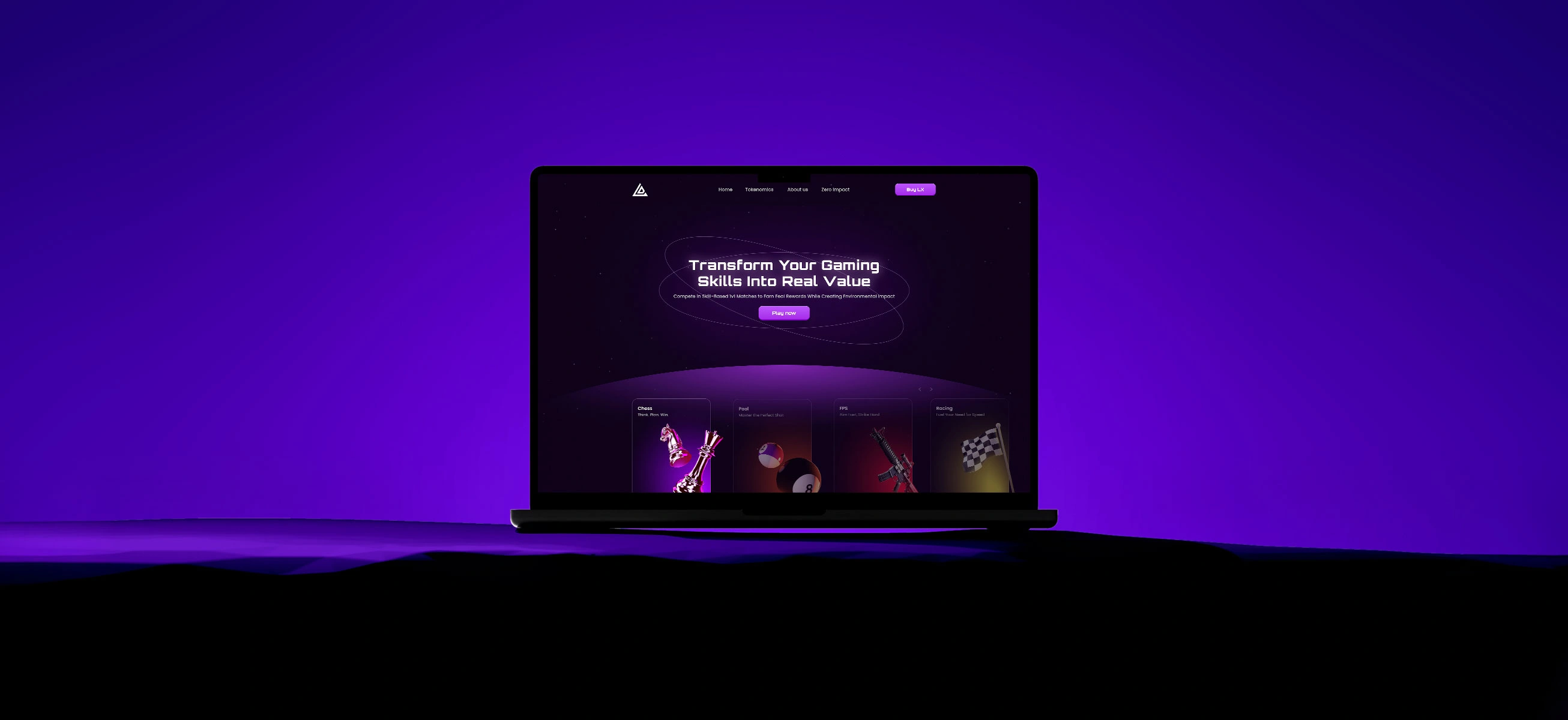
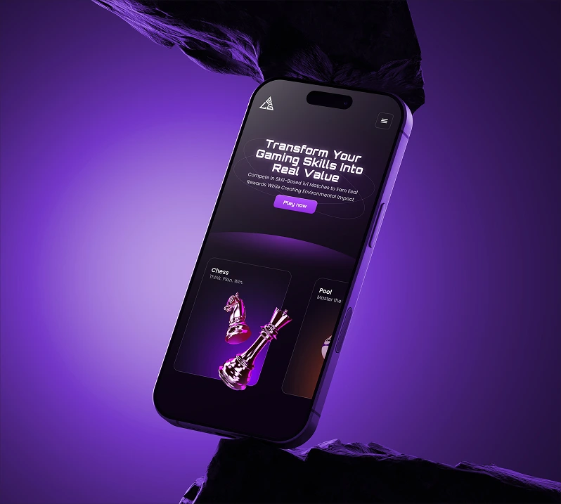
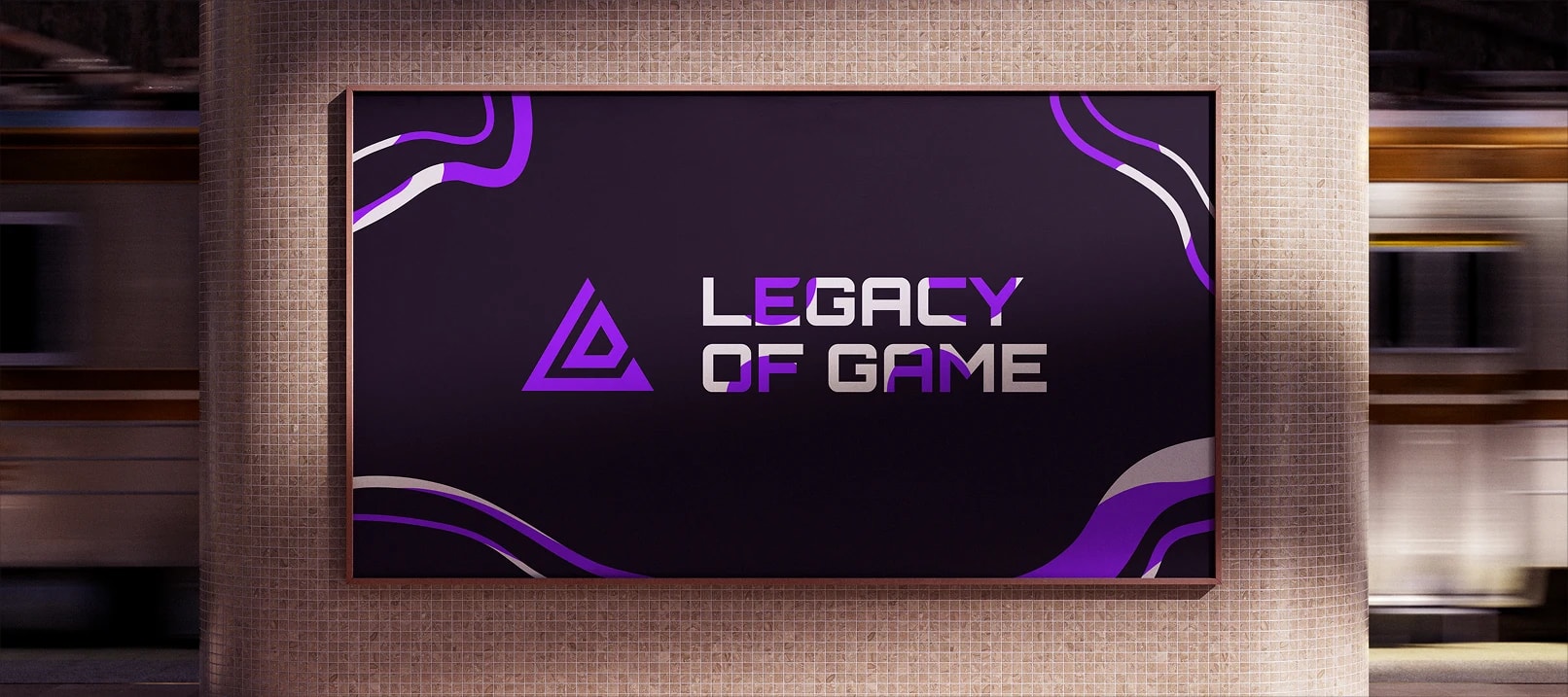
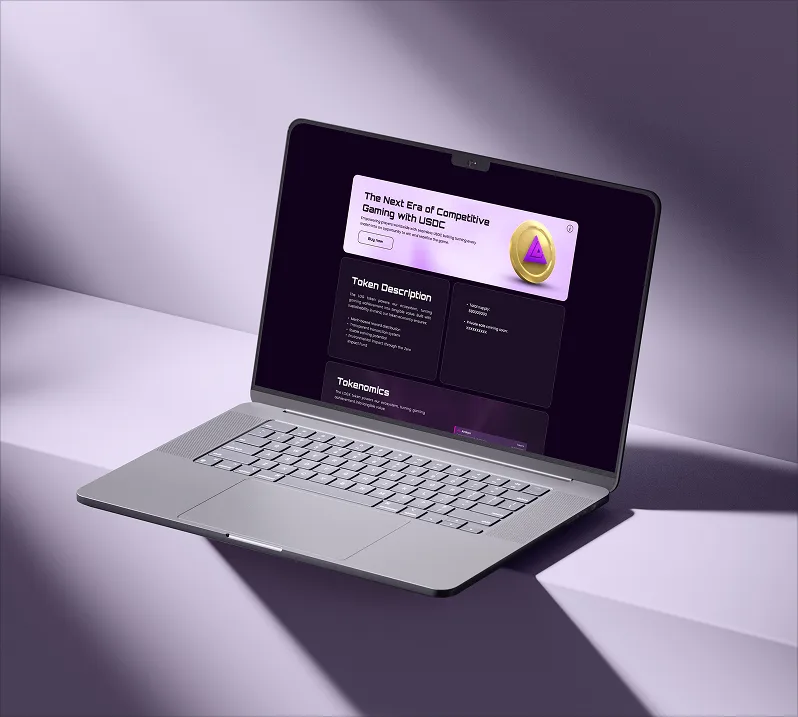
Legacy Of Game is a platform combining gaming and crypto, allowing users to bet cryptocurrency on classic games like chess and pool. The project includes a proprietary crypto, LOG, designed to grow in value over time. An ambitious ecosystem that required a strong identity and commensurate communication.
- Client
- Legacy of Game
- Industry
- Gaming/Web3
- Services
- Project management
- Location
- Italy
Challenge
Building the identity and digital presence of a platform operating in the complex Web3 sector from scratch, where credibility and design are decisive in earning the trust of a demanding and sceptical audience.
Solution
We managed the entire project end-to-end: branding, website, game creation, social campaign and 3D assets, coordinating each phase with a structured project management approach to ensure consistency and quality across all touchpoints.
- 01Discovery
Briefing
Brand analysis
Roadmap
Moodboard
- 02Branding
Visual identity
Tone of voice
Positioning
Moodboard
- 03Production
3D assets
Social campaign
Website
Copywriting
- 04Management
Coordination
Timeline
Review
Delivery




GustaGo
- Branding
- Visual identity
- Social media
- App design
- UX/UI design
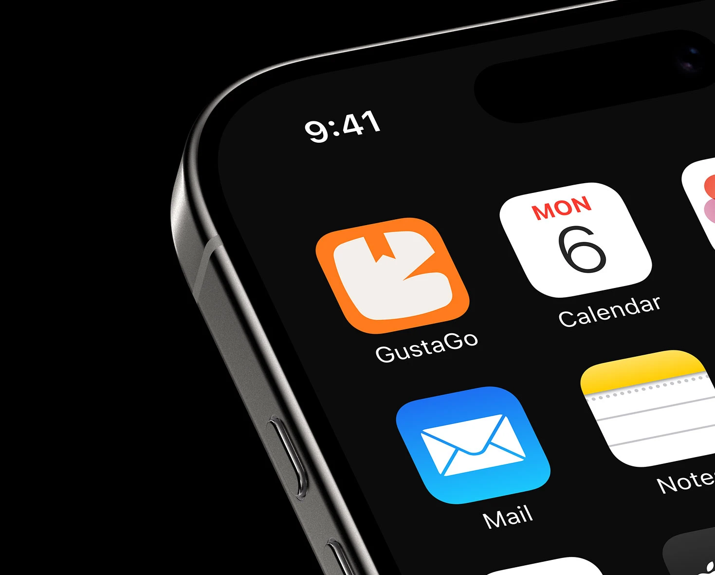
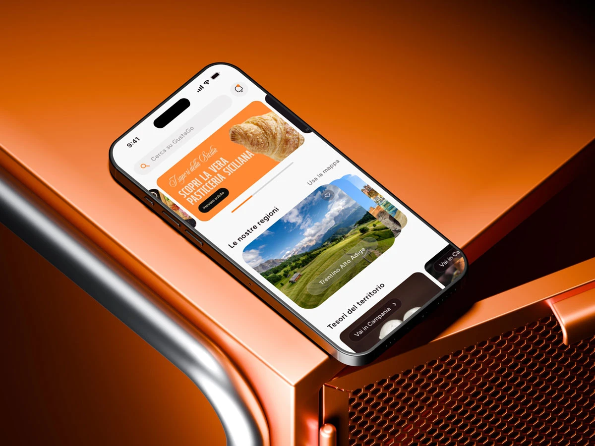
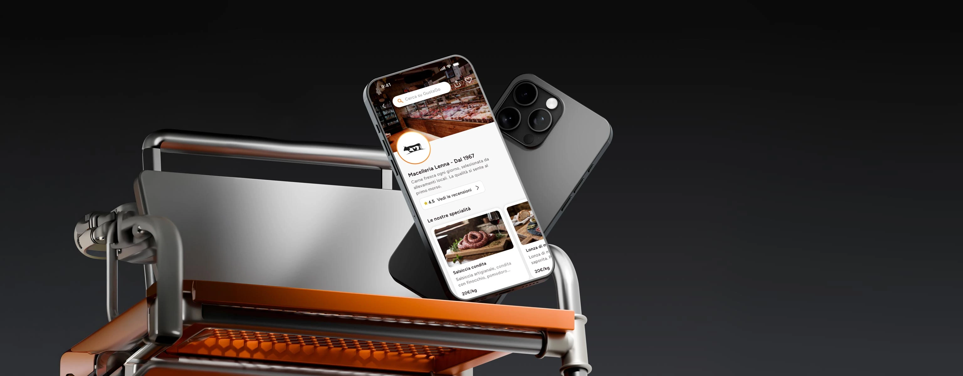
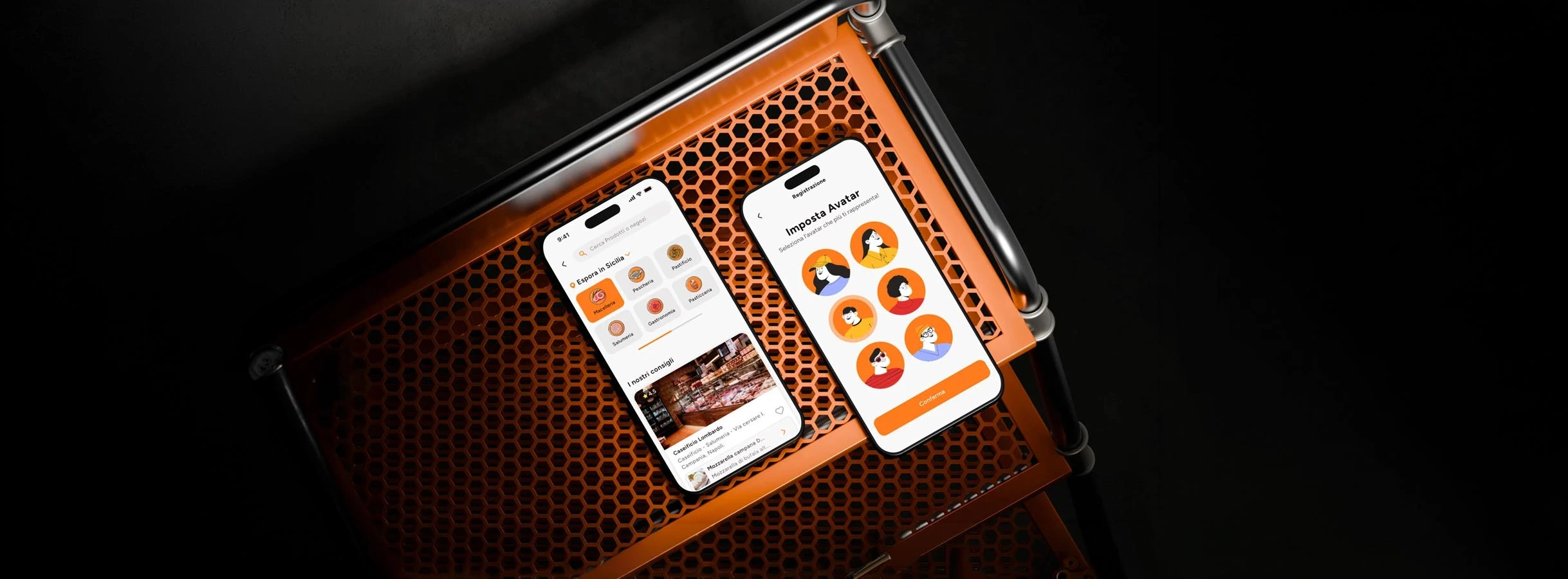
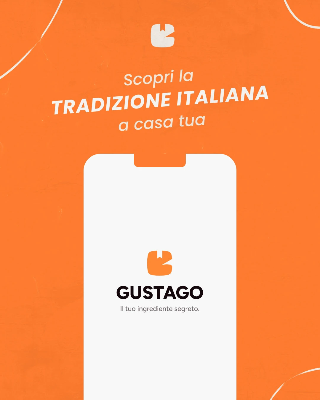
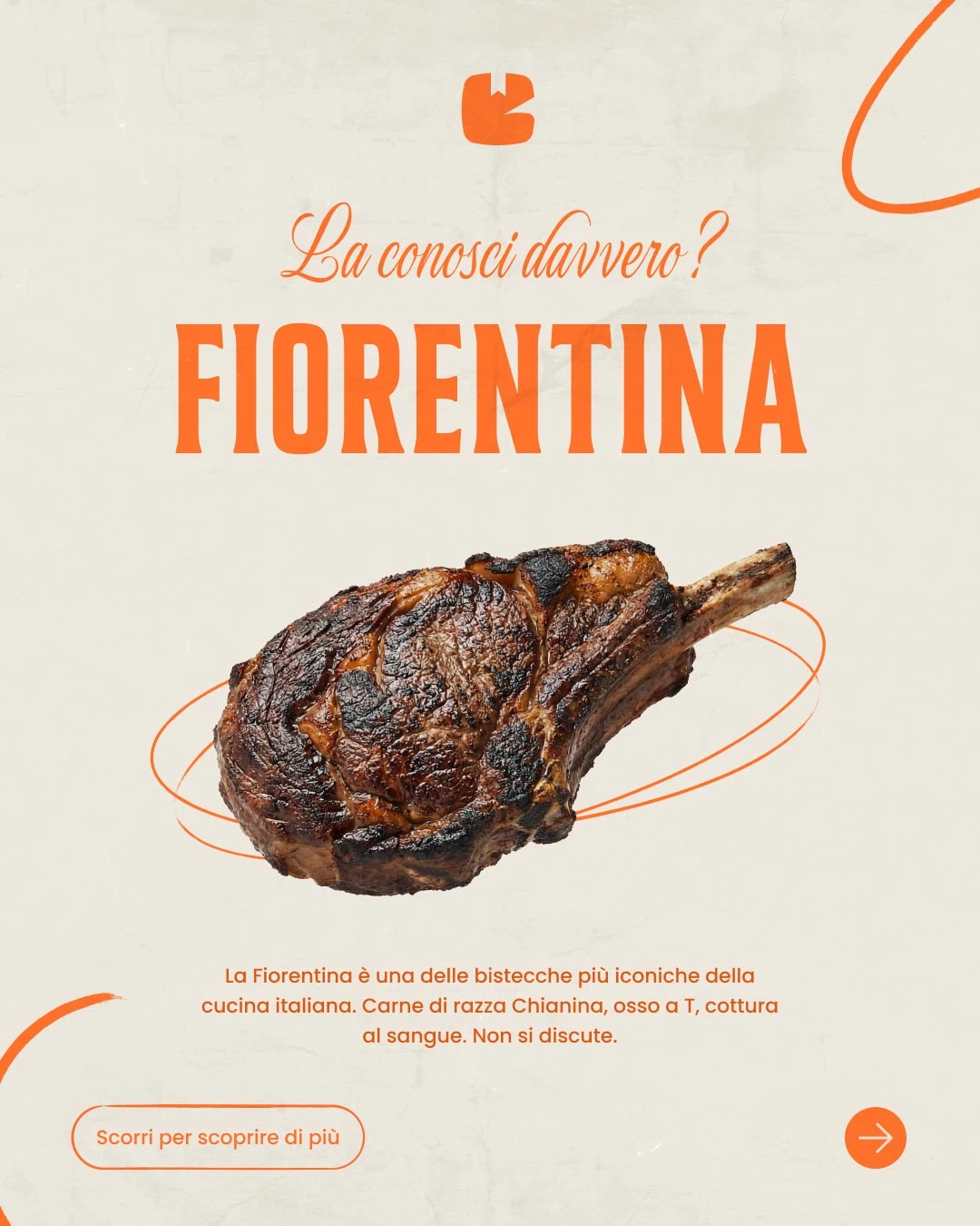
GustaGo is a delivery service bringing premium and traditional food to your door, highlighting quality products and recipes rooted in local heritage. To stand out in a crowded market and turn interest into orders, they needed an appetising visual identity, social content that made people want to order, and a clear app to browse, pay and get delivery.
- Client
- GustaGo
- Industry
- Food delivery
- Services
- Branding, social media and app design
- Location
- Italy
Challenge
Telling the premium-and-traditional story online without generic food delivery clichés, with a coherent visual system across social, banners and the app, where every tap should lead to ordering without friction.
Solution
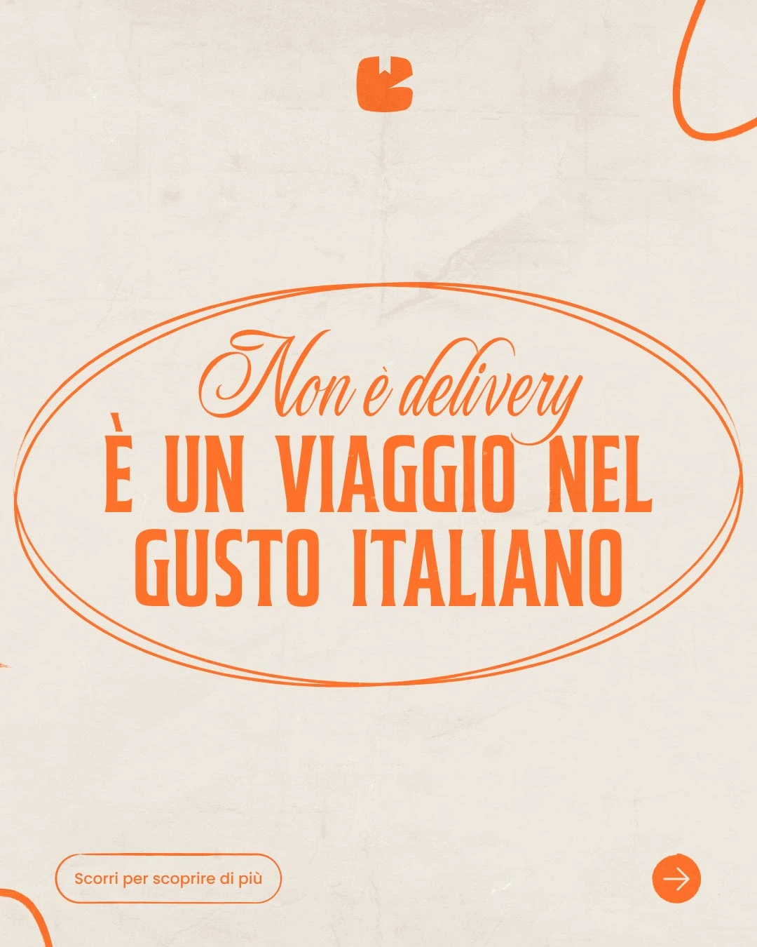
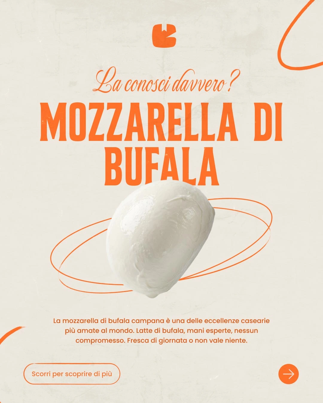
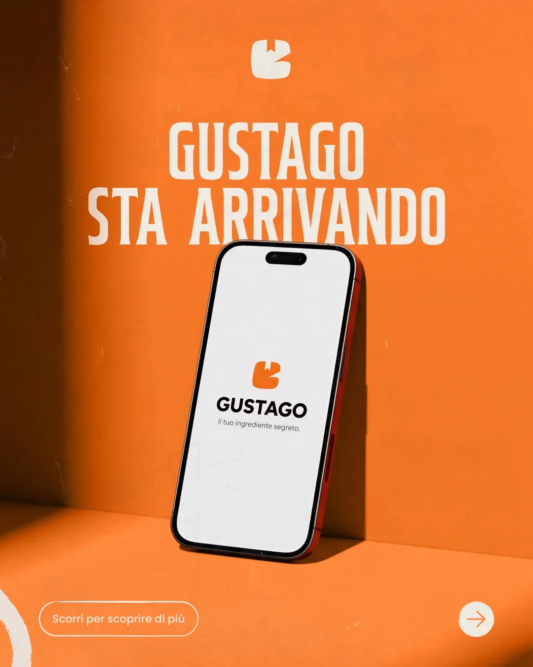
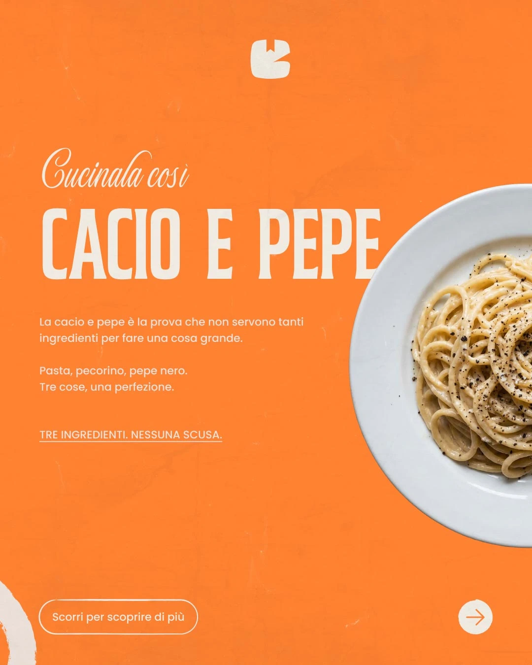
We developed warm, refined branding and social design, and designed the app with UX/UI aligned to the same identity: a readable catalogue, a straightforward order flow and touchpoints ready for campaigns and acquisition.
- 01Discovery
Briefing
Brand analysis
Roadmap
Moodboard
- 02Branding
Logo concept
Visual identity
Palette and typography
Brand guidelines
- 03Social media
Post templates
Story templates
Asset kit
Tone of voice
- 04App design
UX/UI design
Order flow
Design system
Development handoff
- 05Delivery
Final review
Asset export
Social formats
Handoff

McDonald's
- Social media
- Marketing
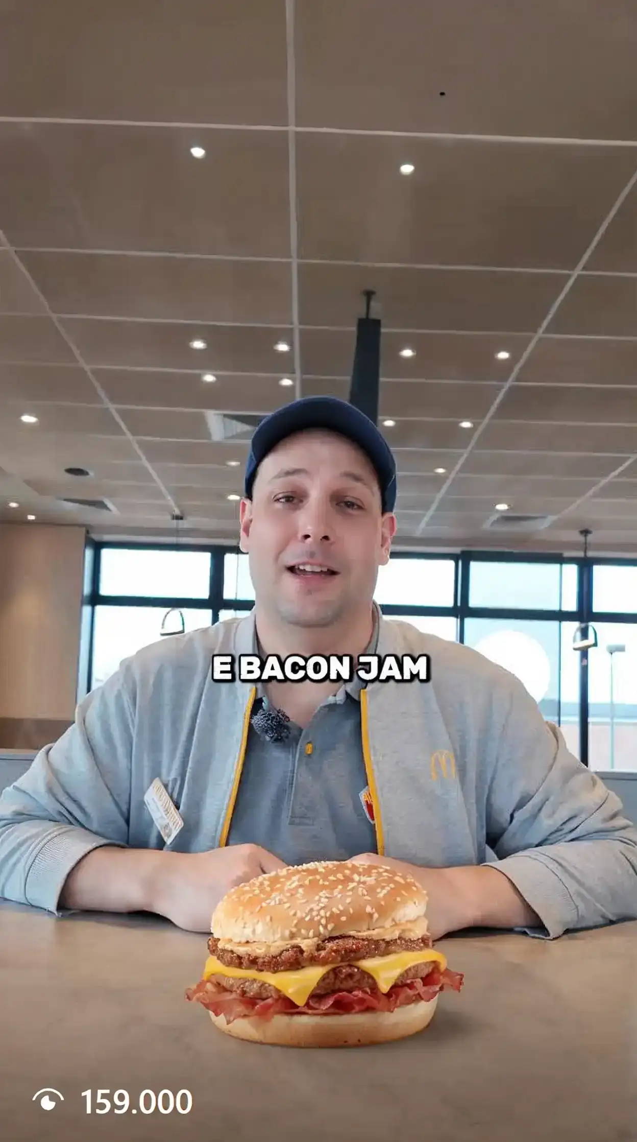
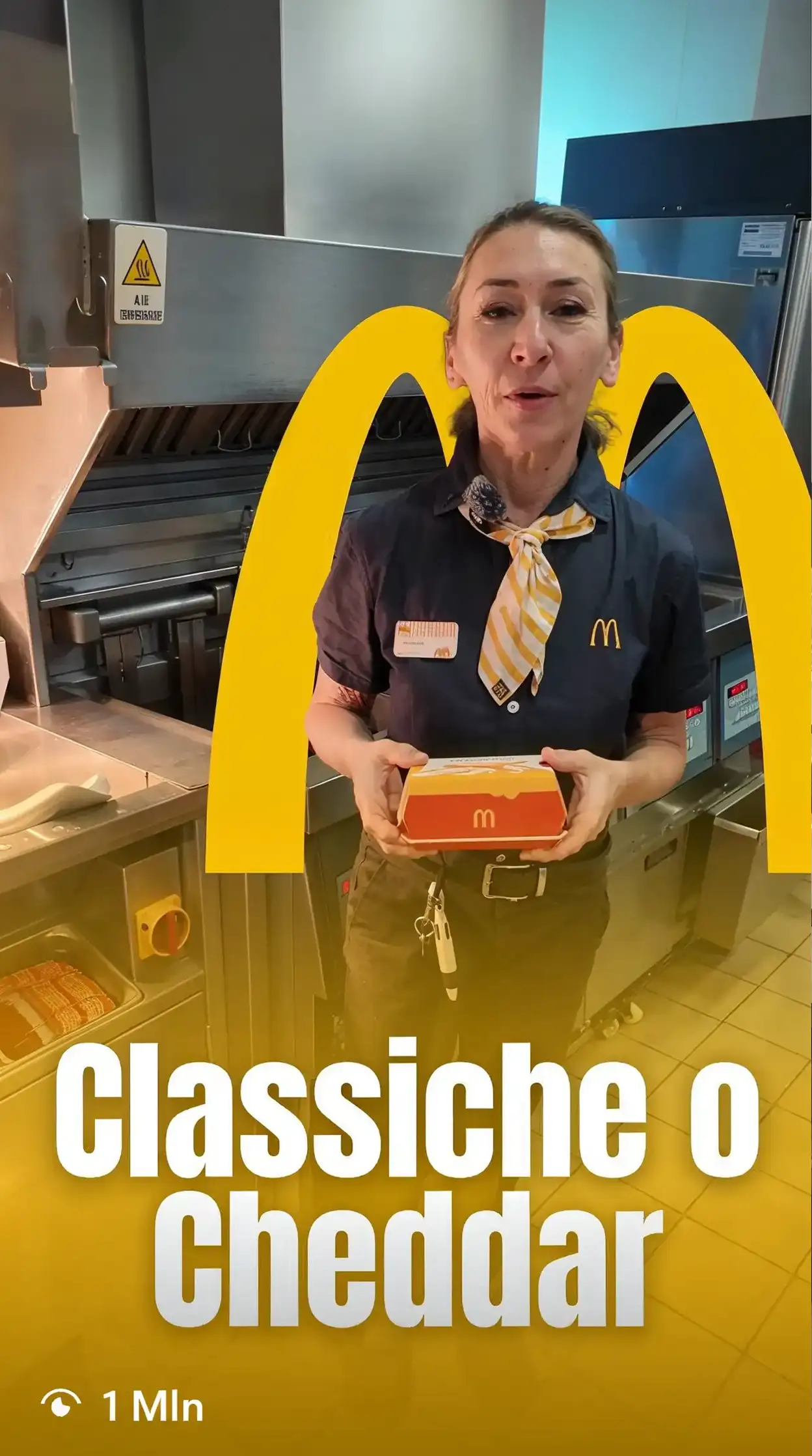
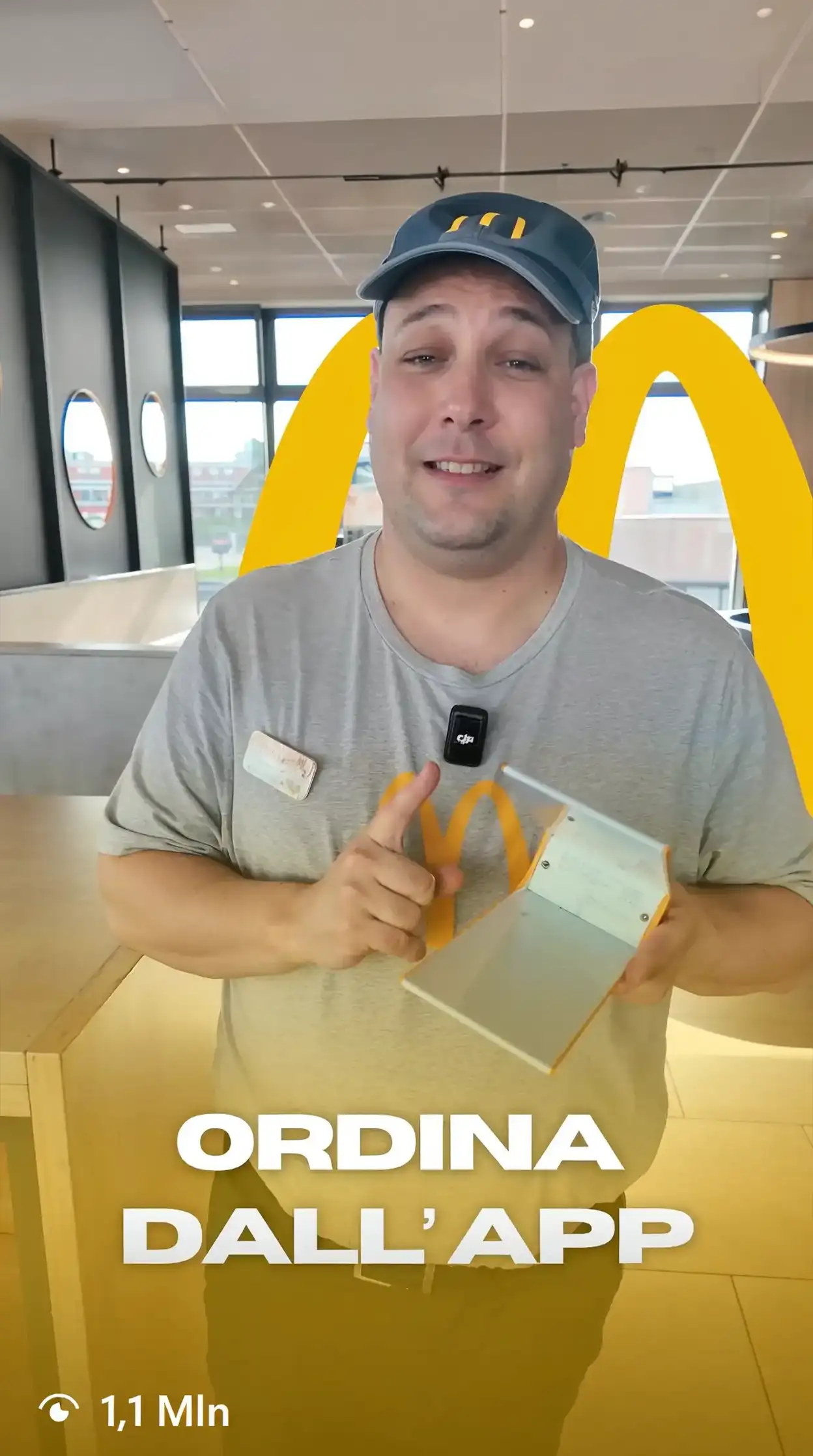
McDonald's is one of the world's most recognisable brands. For two locations in the province of Verona (San Martino Buon Albergo and San Giovanni Lupatoto), we handle social communication with content production designed to speak to the local community.
- Client
- McDonald's
- Industry
- Food
- Services
- Social media
- Location
- Italy
Challenge
Working with a global brand while maintaining authentic, locally rooted communication capable of generating real engagement with a local audience without distorting the brand identity.
Solution
We developed a content strategy based on native reels for the locations' social channels, balancing McDonald's visual identity with a more direct tone closer to the target community.
- 01Discovery
Briefing
Brand analysis
Roadmap
Moodboard
- 02Strategy
Target definition
Editorial plan
Tone of voice
Benchmark
- 03Production
Filming
Editing
Copywriting
Publishing
- 04Analysis
Monitoring
Reporting
Optimisation
Iteration
Giacchi Automobili
- Social media
- Marketing
- Web design
- Branding
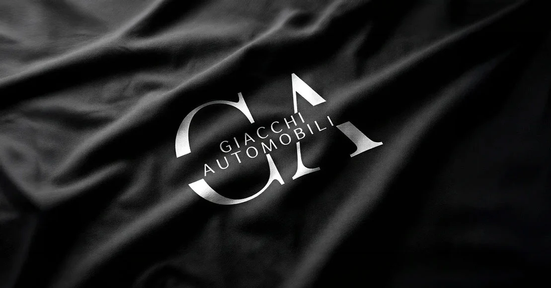
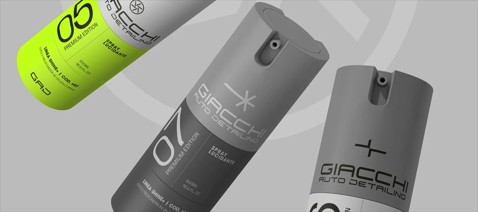
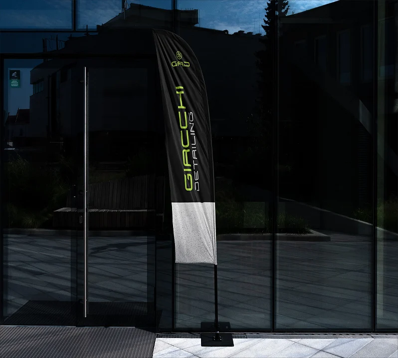
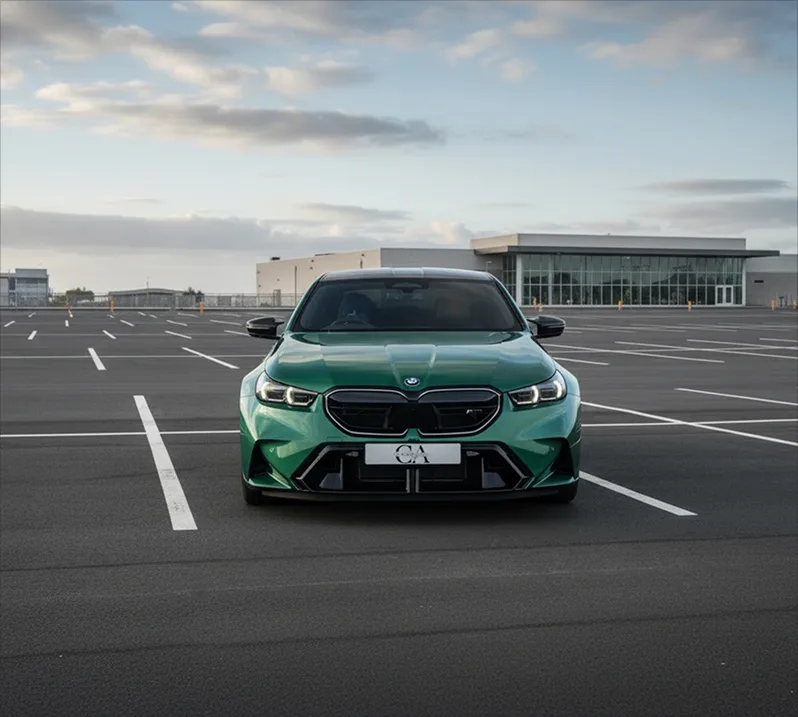
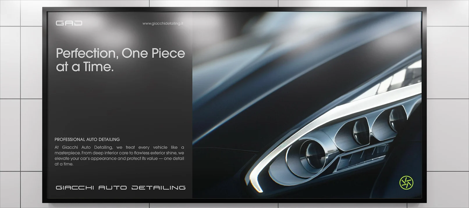
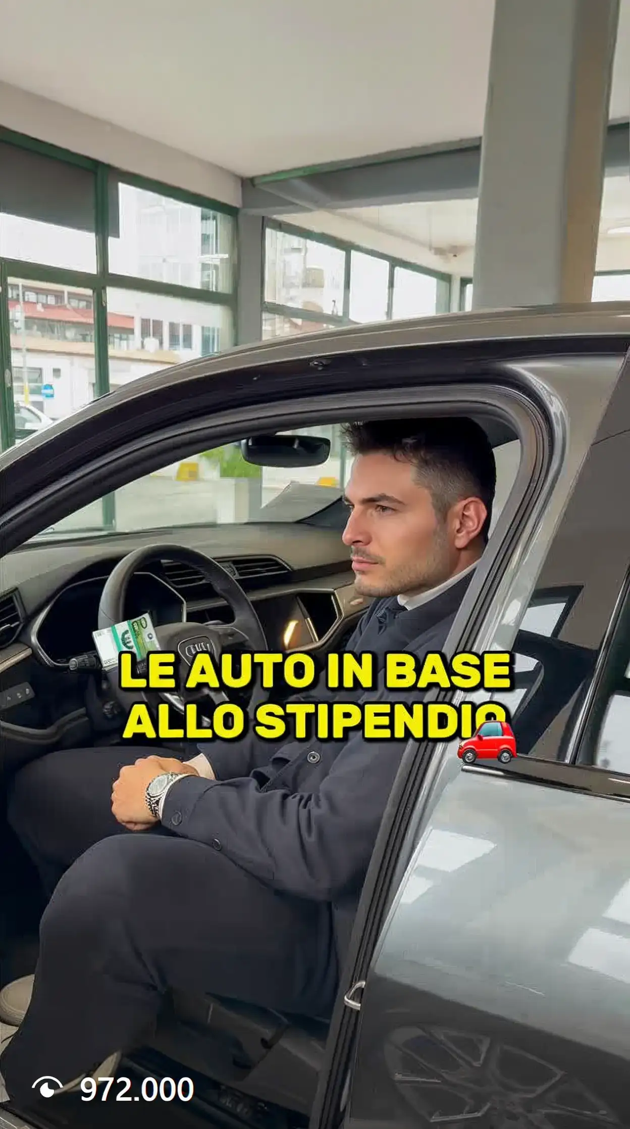
Giacchi Automobili is a multi-brand dealership based in Rovigo. We worked on two fronts: social communication for the dealership and the launch of Giacchi Auto Detailing, a sub-brand dedicated to car detailing with its own identity and website.
- Client
- Giacchi Automobili
- Industry
- Automotive
- Services
- Communication
- Location
- Italy
Challenge
Managing two distinct projects with different goals: building social presence and visibility for the dealership while generating engagement and concrete leads, and launching a sub-brand from scratch in the competitive car detailing sector.
Solution
For Giacchi Automobili we developed a social strategy with reels for TikTok and Instagram and Meta Ads campaigns. For Giacchi Auto Detailing we handled branding and the website, building a coherent and recognisable visual identity from day one.
- 01Discovery
Briefing
Brand analysis
Roadmap
Moodboard
- 02Branding
Visual identity
Tone of voice
Positioning
Asset kit
- 03Communication
TikTok reels
Instagram reels
Copywriting
Meta Ads
- 04Website
Design
Development
Optimisation
Asset delivery



Enei S.p.A.
- Web design
- UX/UI design
- Copywriting
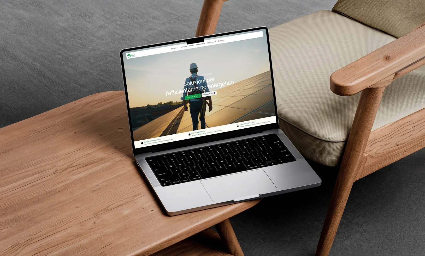
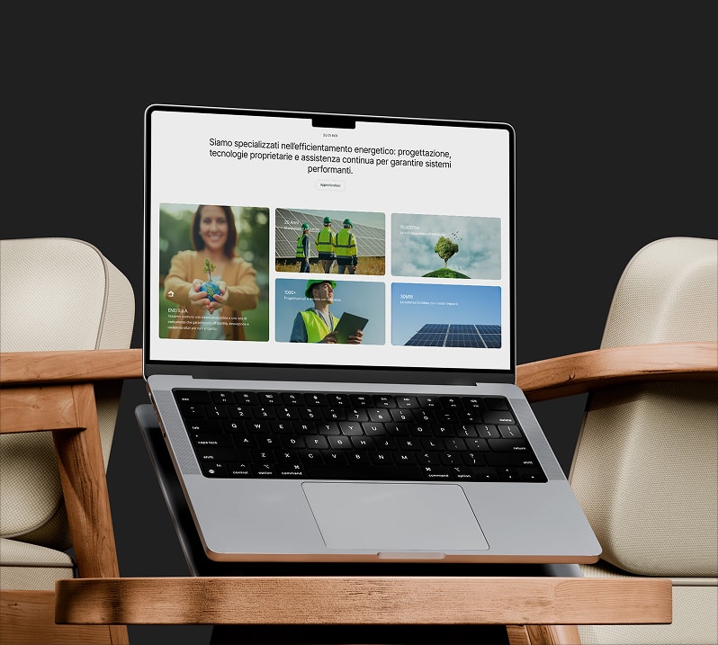
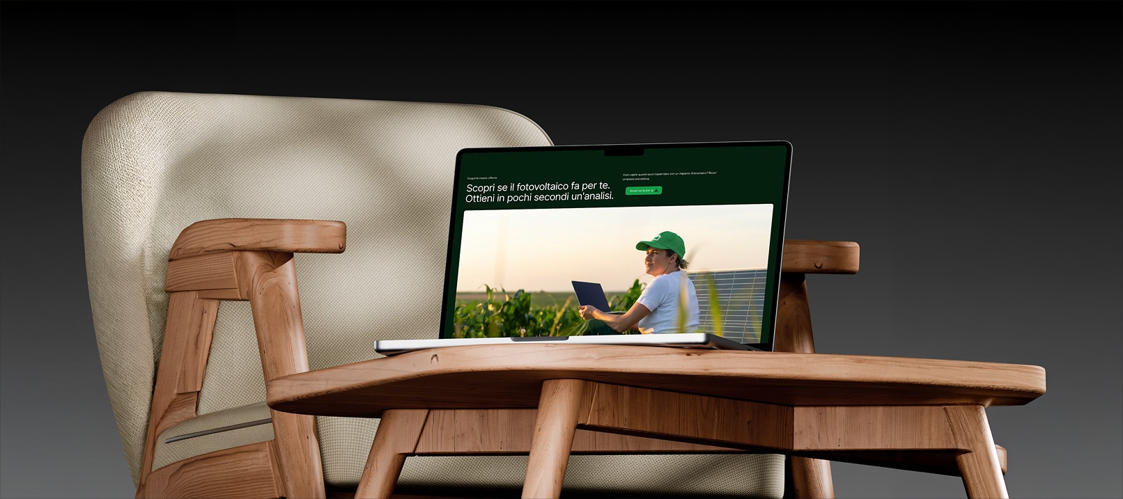
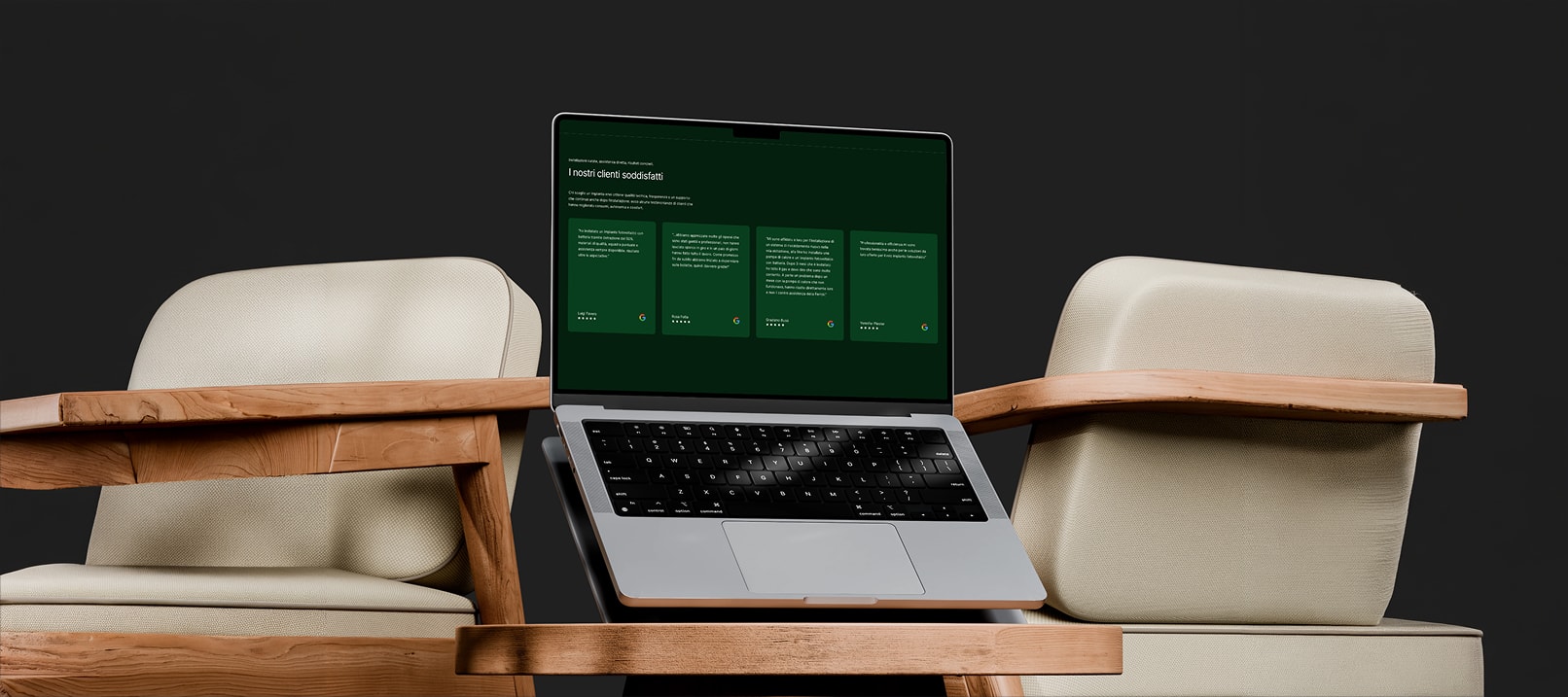
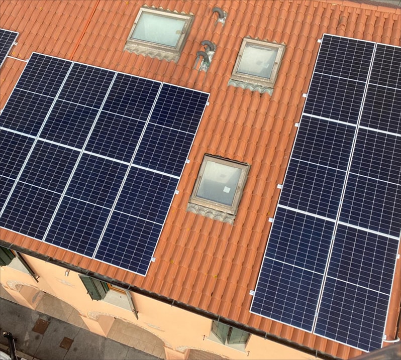
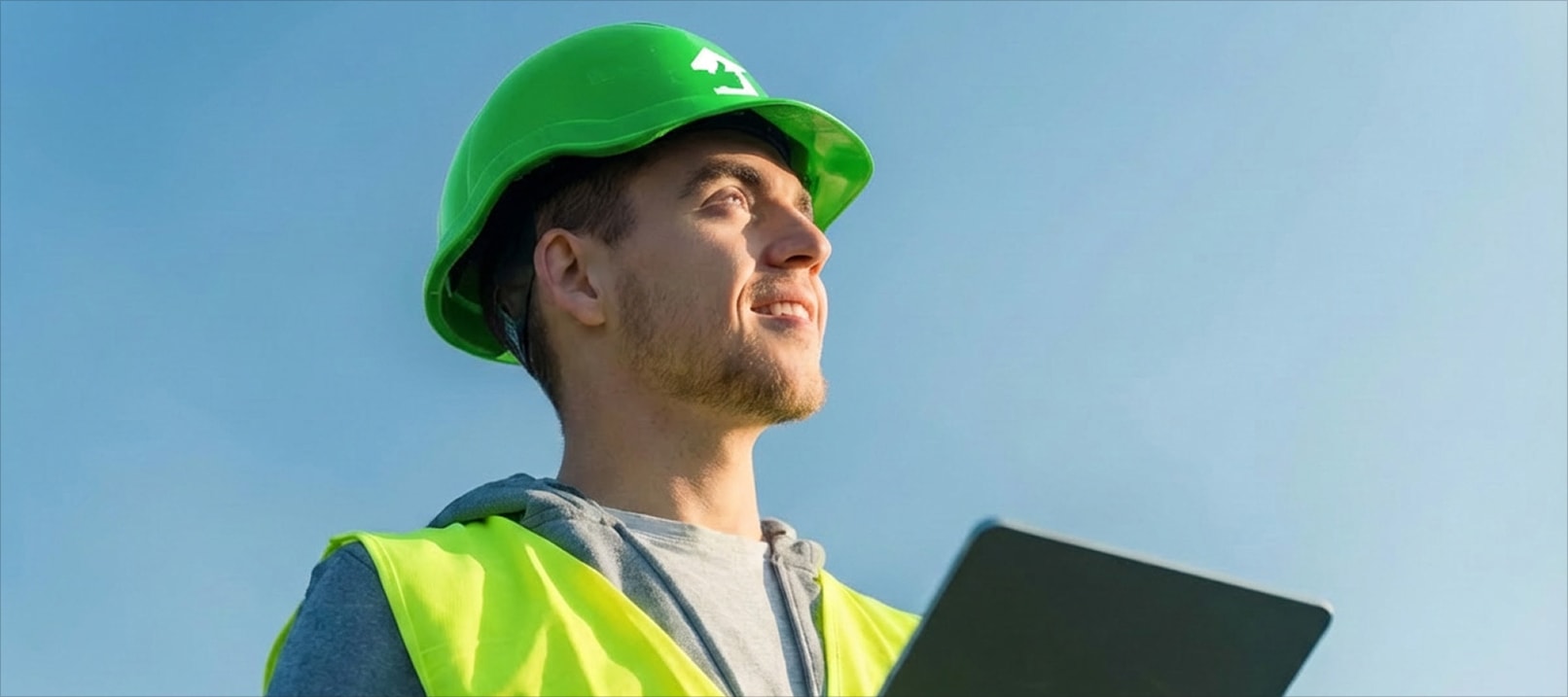
Enei is a company specialising in energy efficiency solutions for individuals and businesses, with 20 years of field experience and over 1,000 completed projects across Italy. They needed a website capable of communicating expertise and reliability while converting visitors into qualified leads.
- Client
- Enei S.p.A.
- Industry
- Energy
- Services
- Web design
- Location
- Italy
Challenge
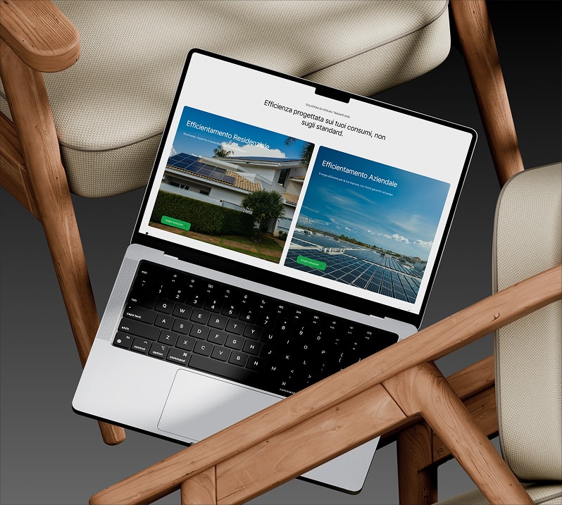
Translating a technical and complex offering into a clear and convincing web experience, speaking to both residential and business audiences without losing authority or navigational simplicity.
Solution
We designed a website structured to guide users toward conversion, with sections dedicated to the two main audiences, clear content and a personalised analysis path that turns every visit into a contact opportunity.
- 01Discovery
Briefing
Brand analysis
Roadmap
Moodboard
- 02Strategy
Target definition
Content architecture
Wireframes
User flow
- 03Design
UI design
Components
Responsive
Visual identity
- 04Development
Webflow development
CMS
Optimisation
Delivery



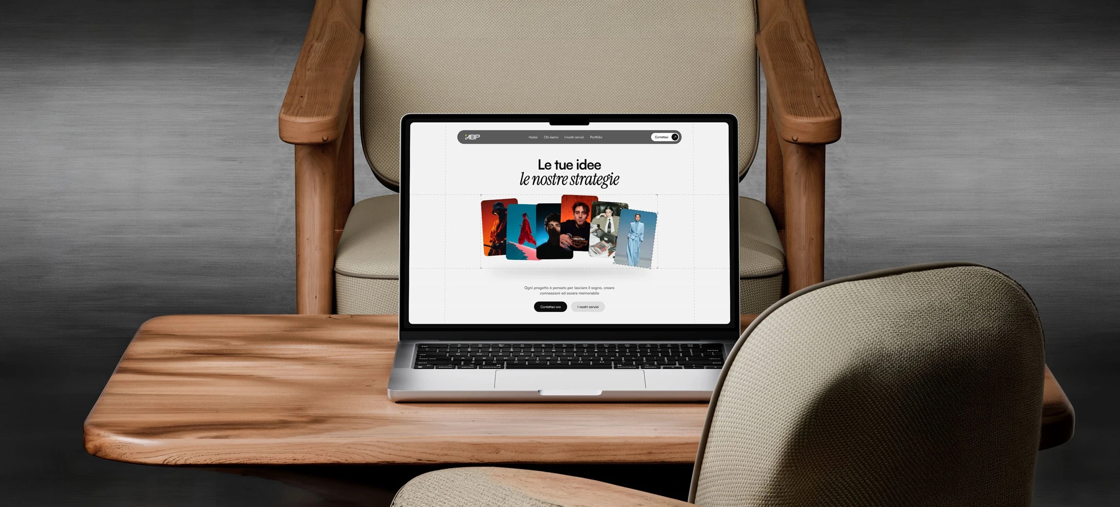
MBP Productions
- Web design
- Social media
- Marketing
- UX/UI design
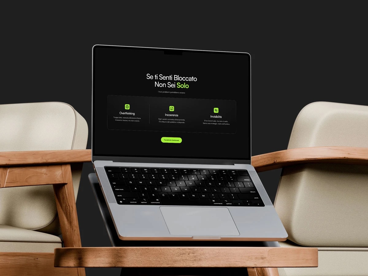
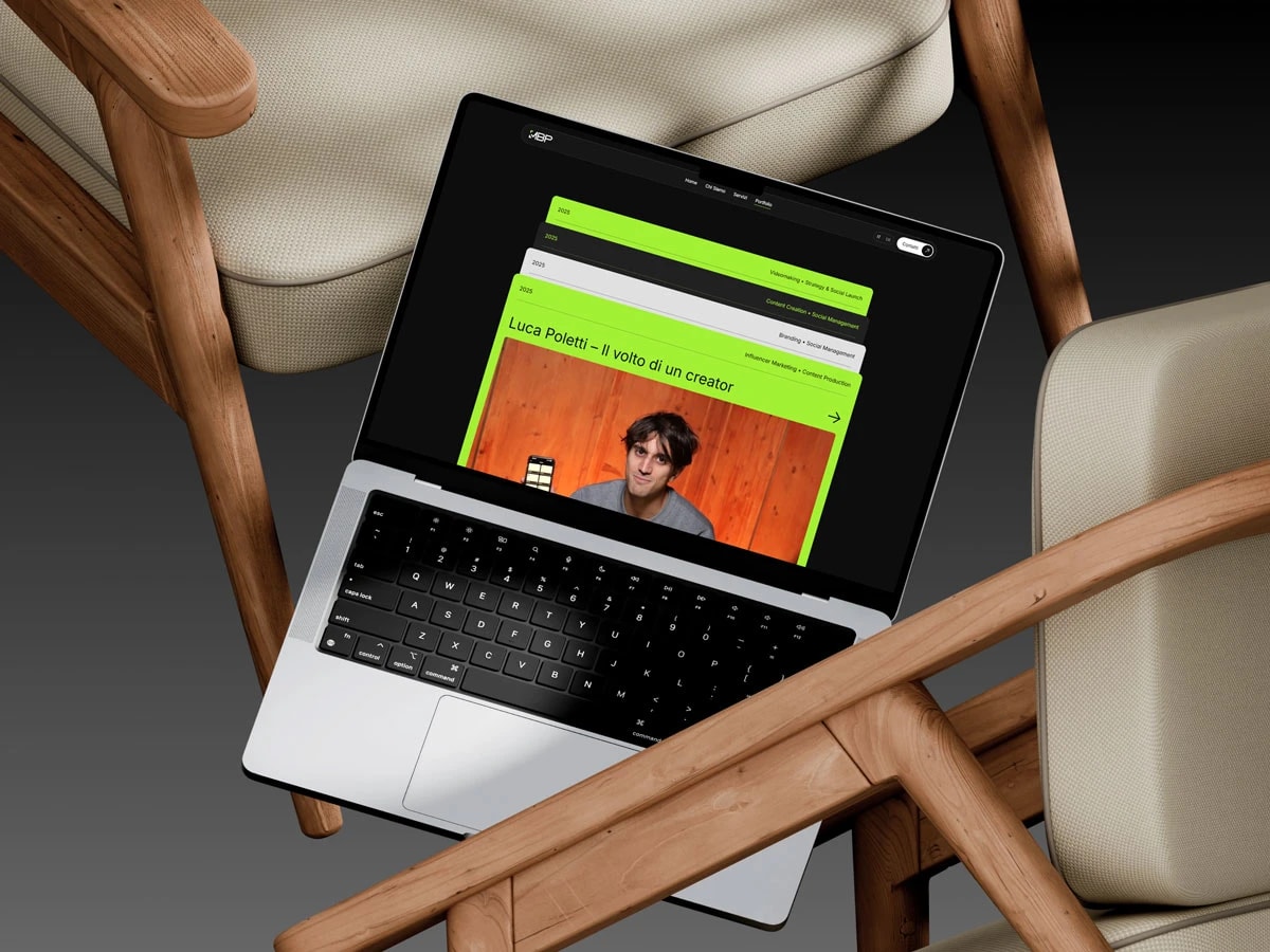
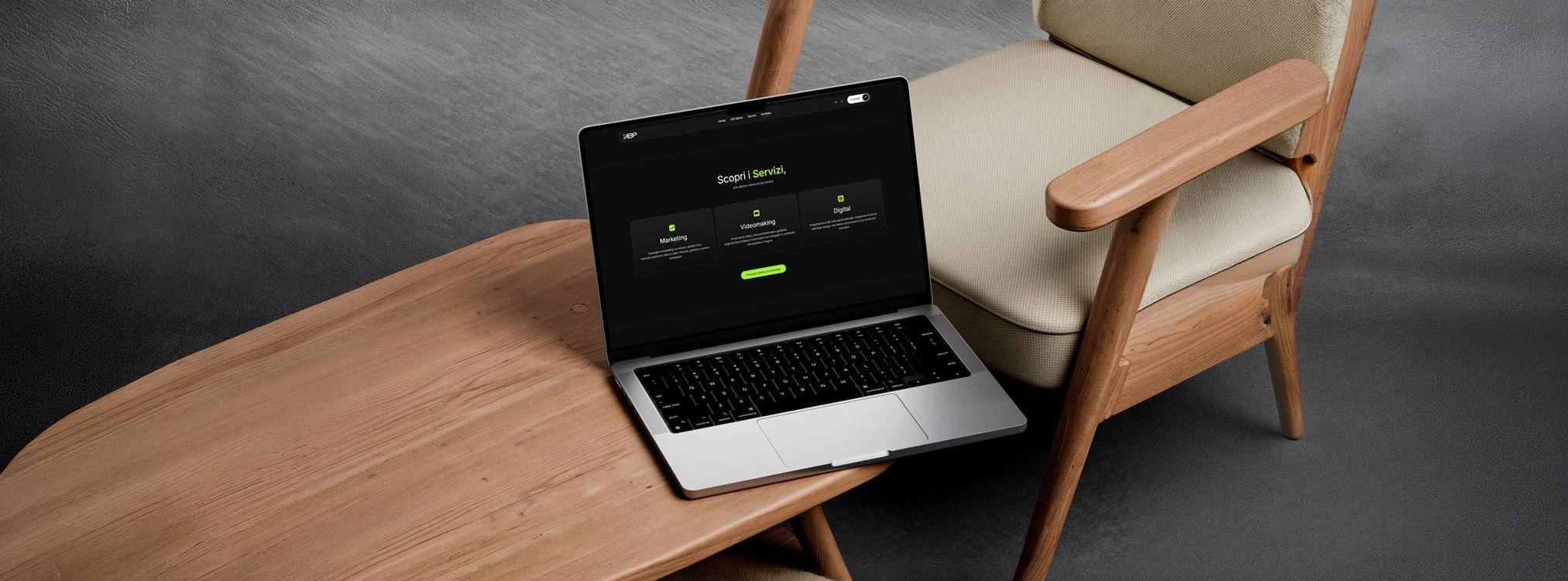
MBP Productions is a communication and marketing agency offering social media management, marketing strategies and design services for brands that want to grow with curated content and a coherent image. To present all of this clearly and convert new leads, they needed a website worthy of their approach.
- Client
- MBP Productions
- Industry
- Communication and marketing
- Services
- Web design
- Location
- Italy
Challenge
Telling a diverse offering online (SMM, marketing and design) without losing the visitor, building a digital presence that communicated expertise across all areas and encouraged contact.
Solution
We designed a website with a strong visual identity, dynamic portfolio and contact flows built to convert. Each service has its space, with a path guiding from the work shown to getting in touch.
- 01Discovery
Briefing
Brand analysis
Roadmap
Moodboard
- 02Strategy
Target definition
Content architecture
Wireframes
User flow
- 03Design
UI design
Components
Responsive
Visual identity
- 04Development
Development
Optimisation
Testing
Delivery
Vista360
- Web design
- UX/UI design
- Copywriting
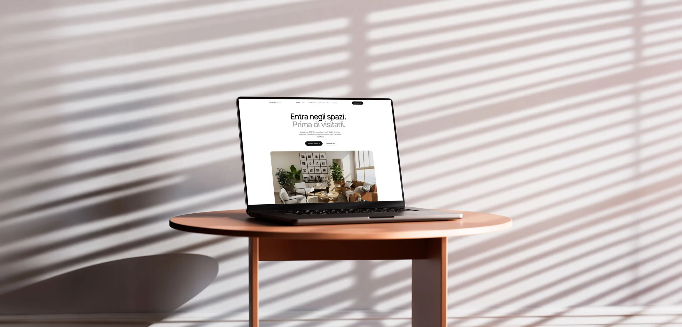
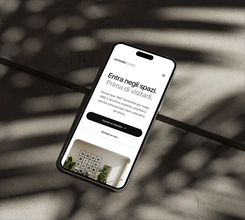
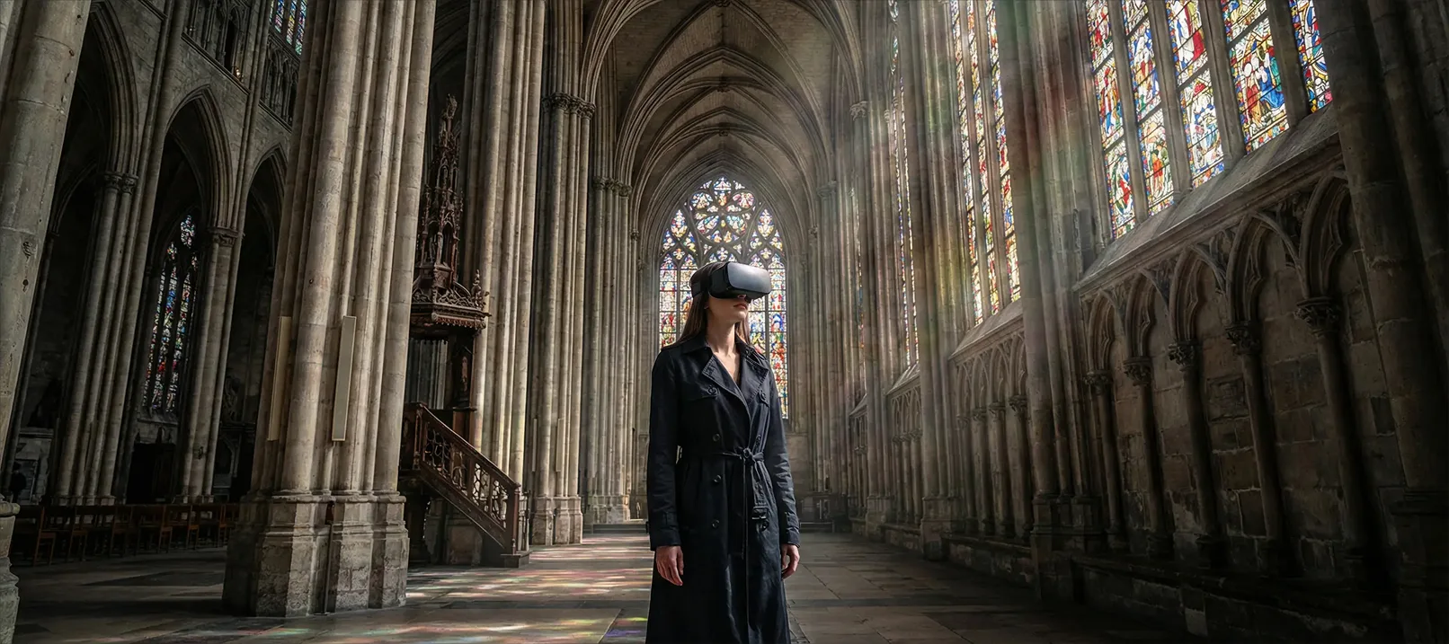
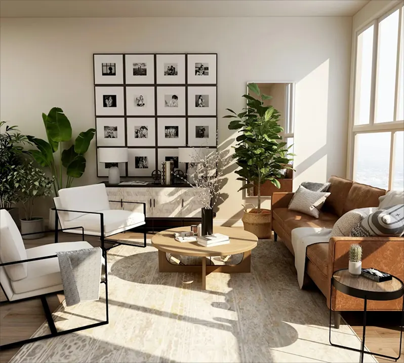
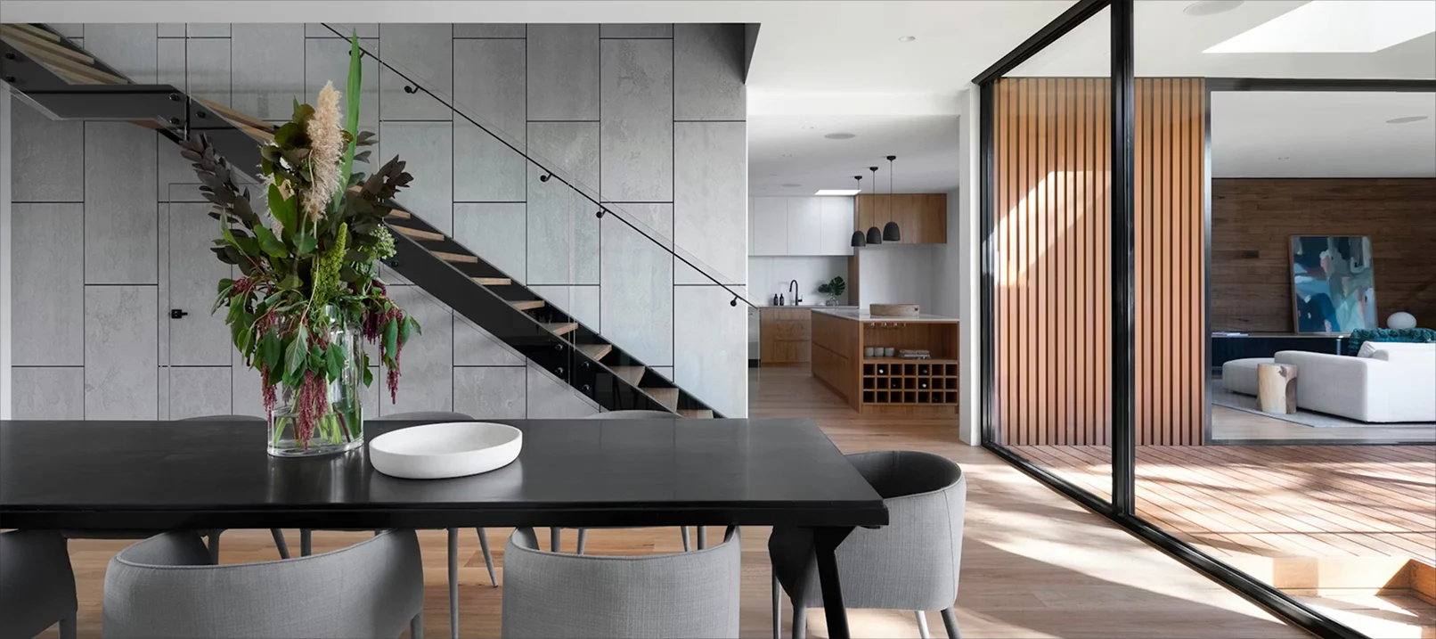
Vista360 creates 360° virtual tours for hotels, hospitality venues, commercial businesses, cultural heritage and territories, letting anyone step inside a space before visiting in person. They needed a website that communicated this experience from the very first screen.
- Client
- Vista360
- Industry
- Virtual tour
- Services
- Web design
- Location
- Italy
Challenge
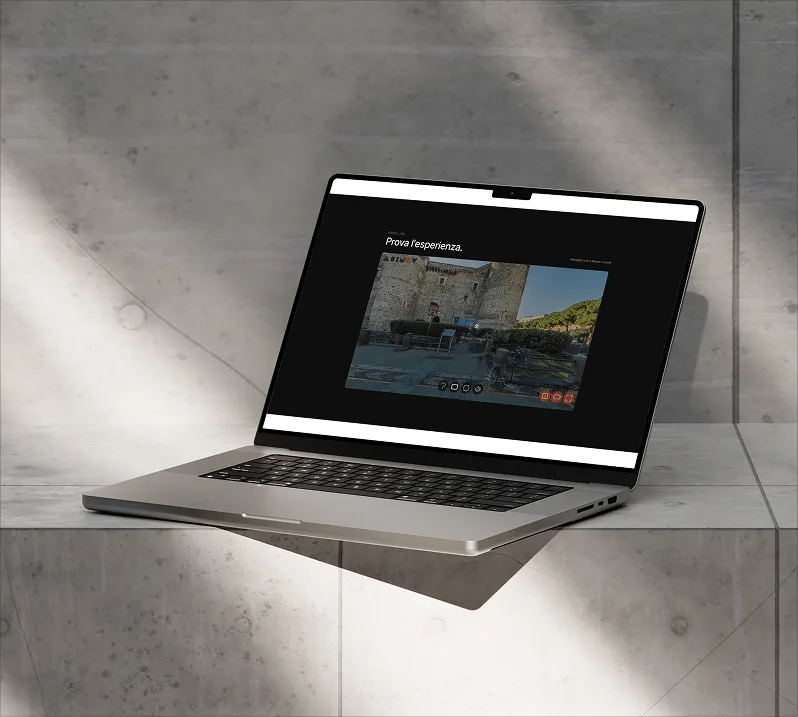
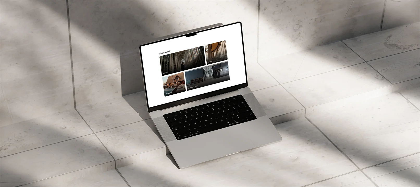
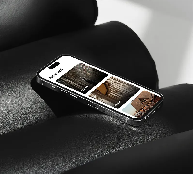
Representing on a web page a product that by nature must be experienced, conveying the value of the virtual tour to very different targets, from churches to museums, hospitality to businesses.
Solution
We designed a website that brings users inside the product from the first scroll, with a visual architecture that guides discovery and dedicated sections for different applications, letting the experience speak louder than the description.
- 01Discovery
Briefing
Brand analysis
Roadmap
Moodboard
- 02Strategy
Target definition
Content architecture
Wireframes
User flow
- 03Design
UI design
Components
Responsive
Visual identity
- 04Development
Custom development
Optimisation
Testing
Delivery
Prima Soluzioni
- Social media
- Marketing
- Web design
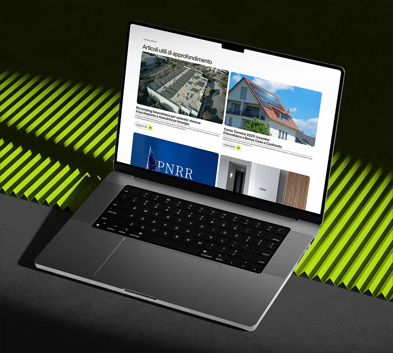
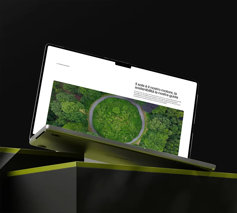
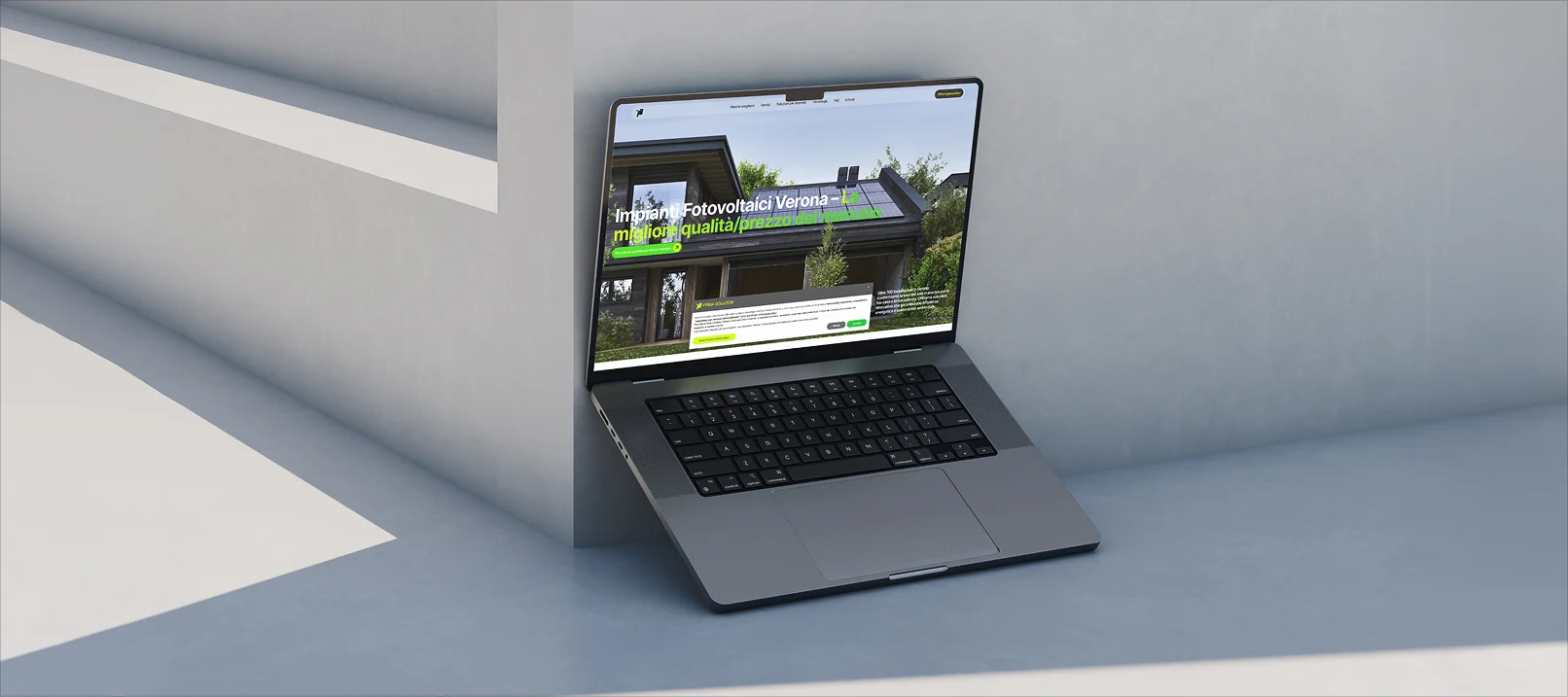
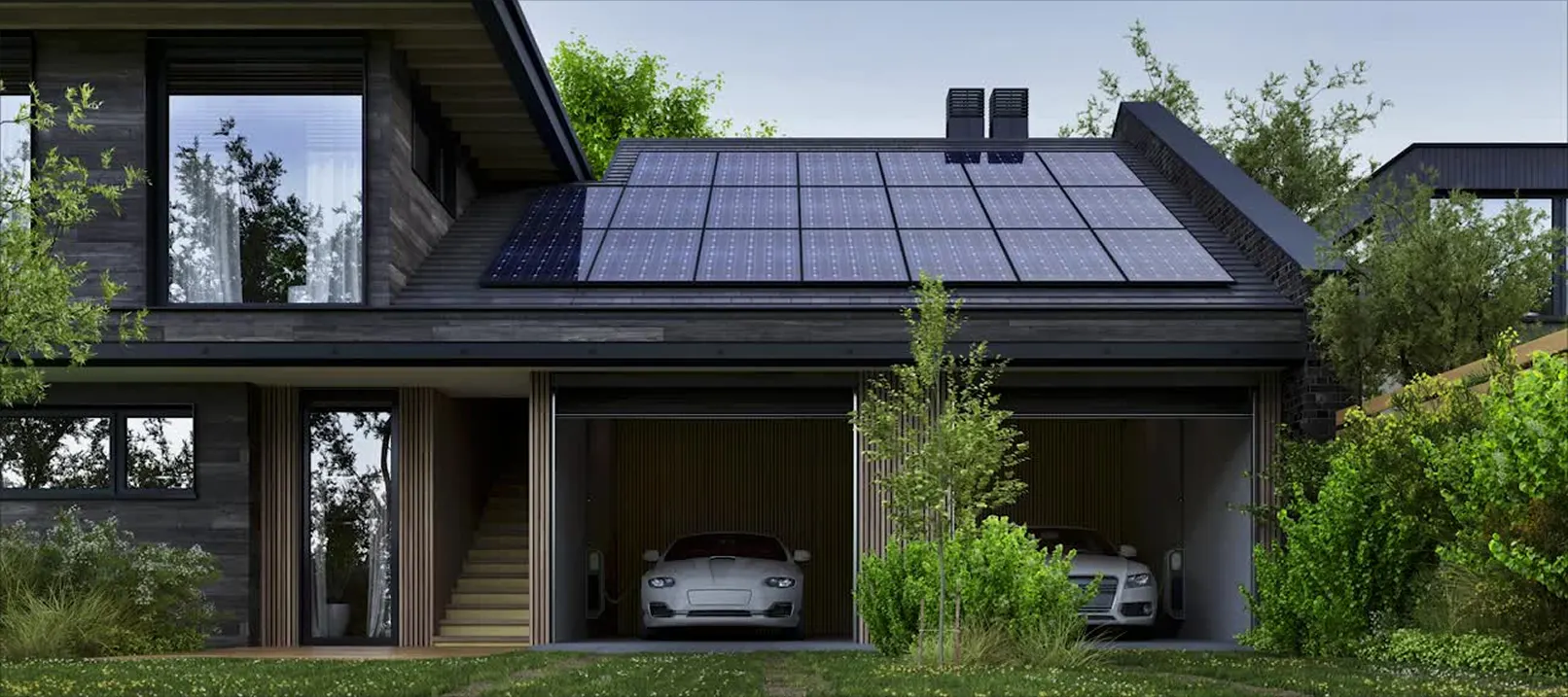
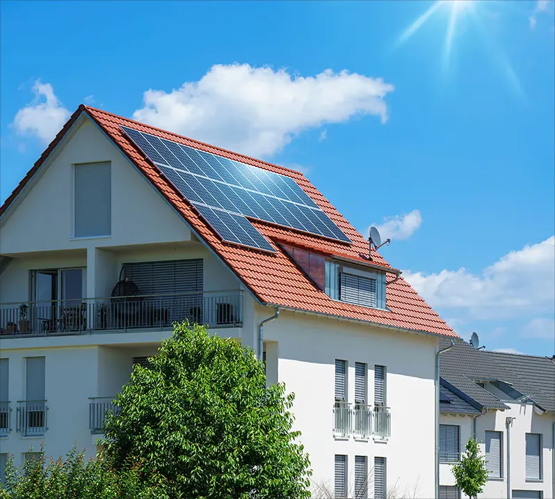
Prima Soluzioni is a company specialising in photovoltaic systems for individuals and businesses, with over 700 completed installations in Veneto and Lombardy. They focus on quality, transparency and in-house installations. They needed a digital presence capable of communicating reliability and generating qualified leads.

- Client
- Prima Soluzioni
- Industry
- Energy
- Services
- Social media and web design
- Location
- Italy
Challenge
Standing out in the crowded photovoltaic market, where competition is high and client trust is everything, by building a credible digital presence oriented toward conversion.
Solution
We designed the website with a clear architecture built to guide users from the first click to a quote request. In parallel we developed social communication that strengthens brand credibility and feeds the contact pipeline.
- 01Discovery
Briefing
Brand analysis
Roadmap
Moodboard
- 02Strategy
Target definition
Content architecture
Editorial plan
Benchmark
- 03Design
UI design
Components
Responsive
Visual identity
- 04Delivery
Development
Optimisation
Publishing
Handoff

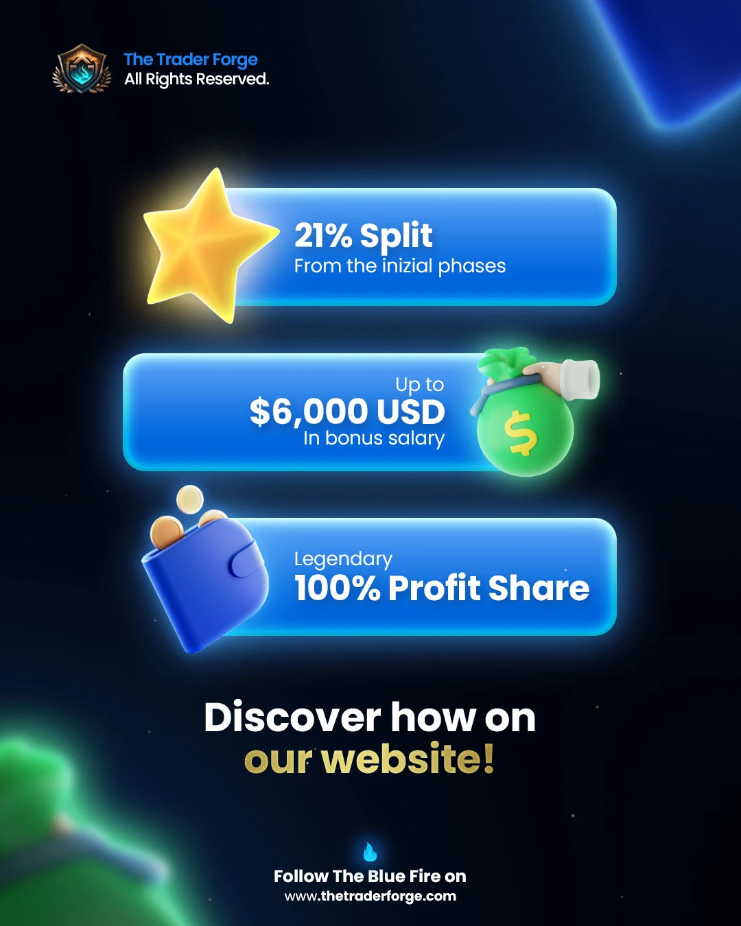
The Trader Forge
- Branding
- Visual identity
- Social media
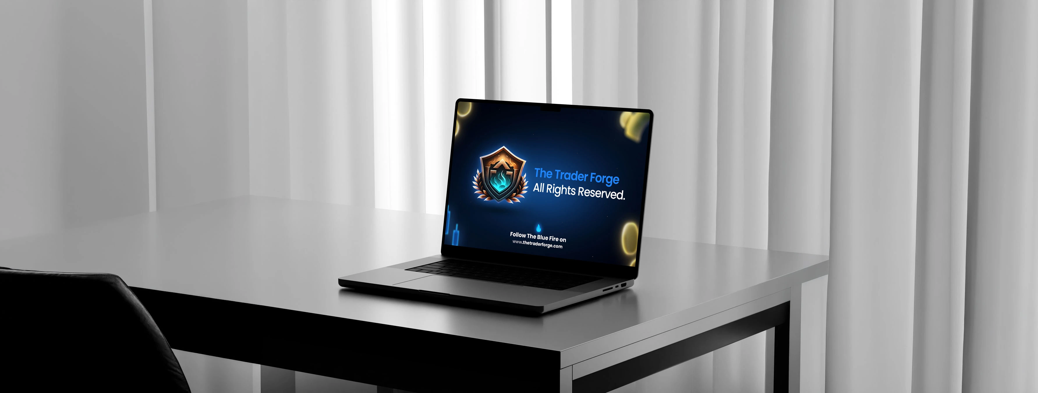
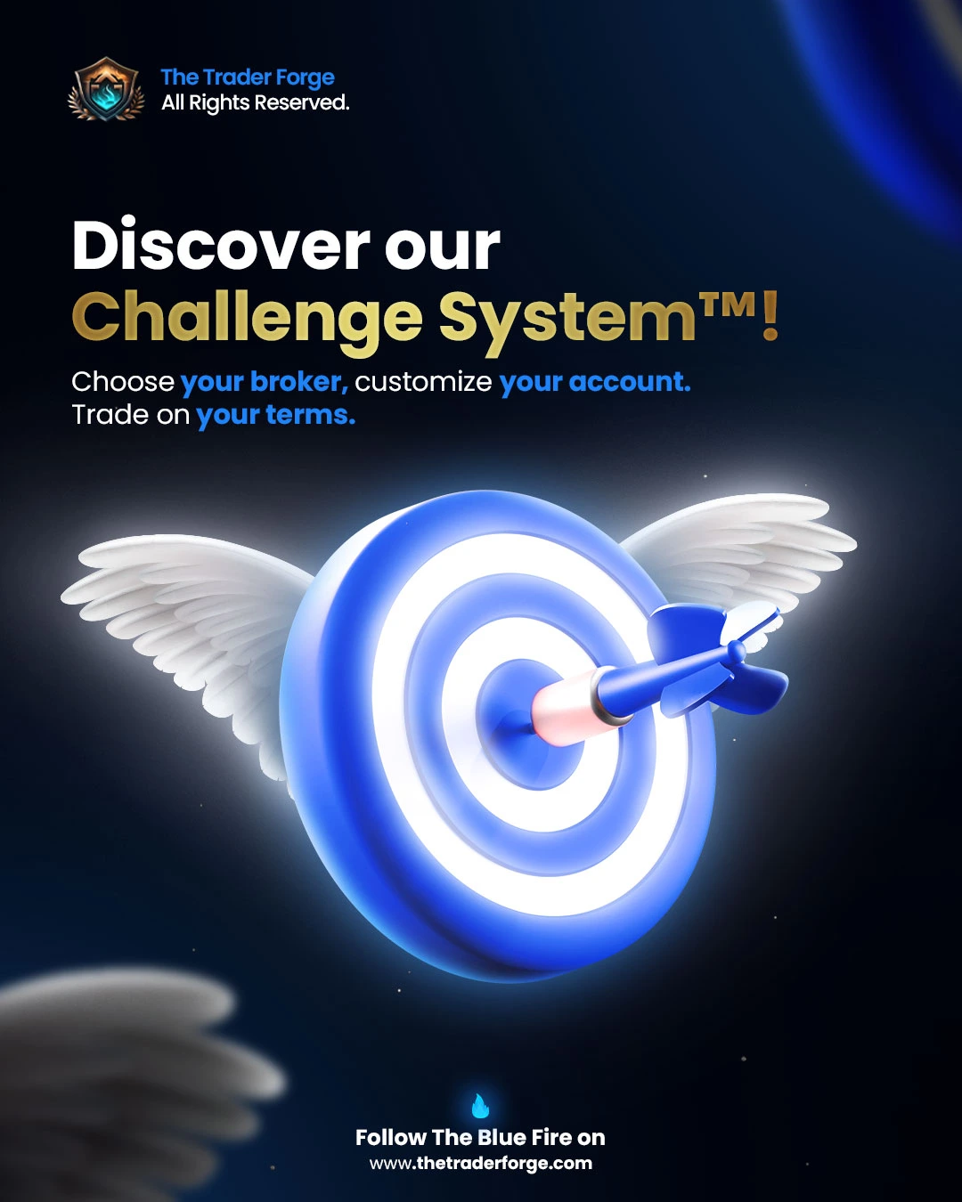
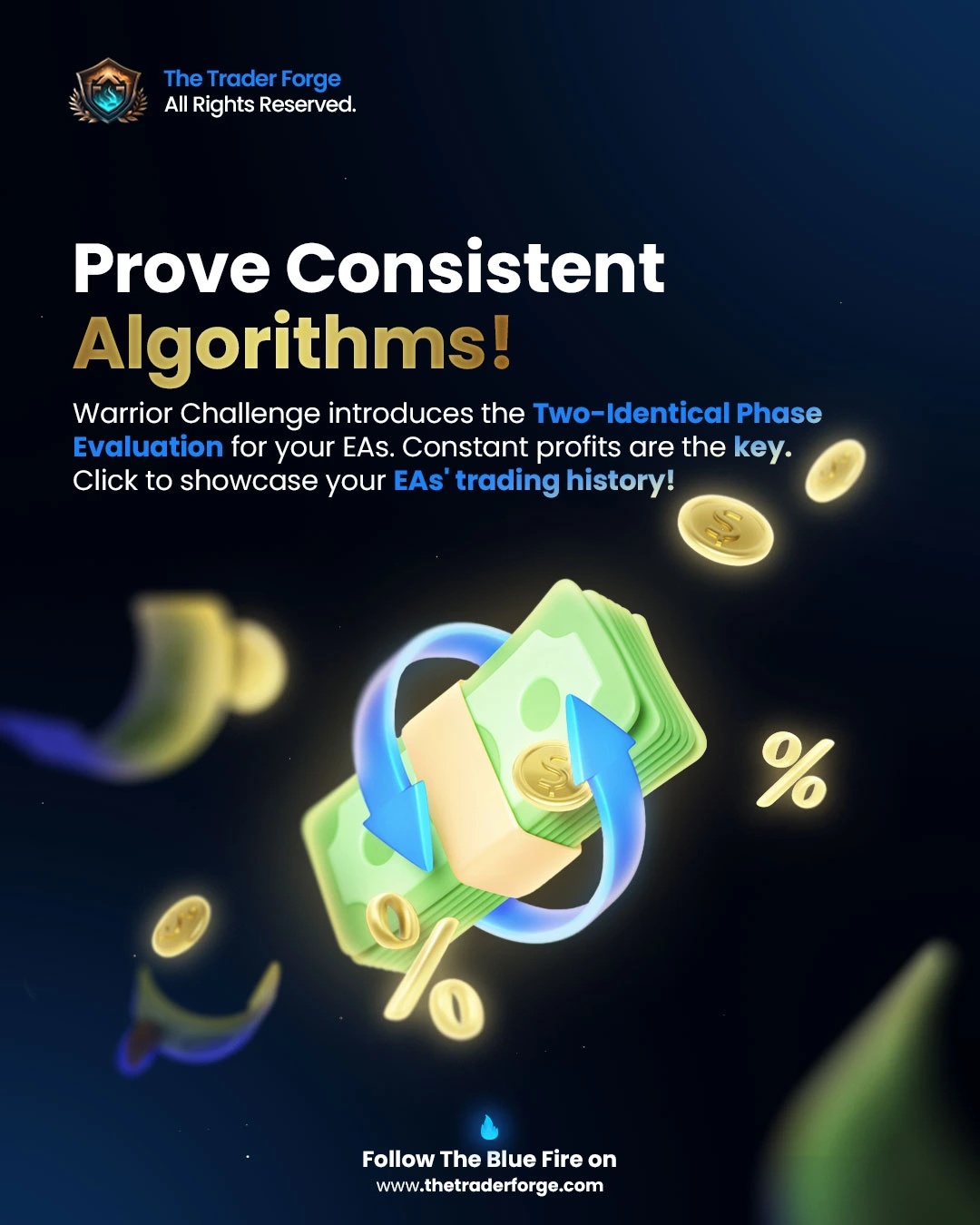
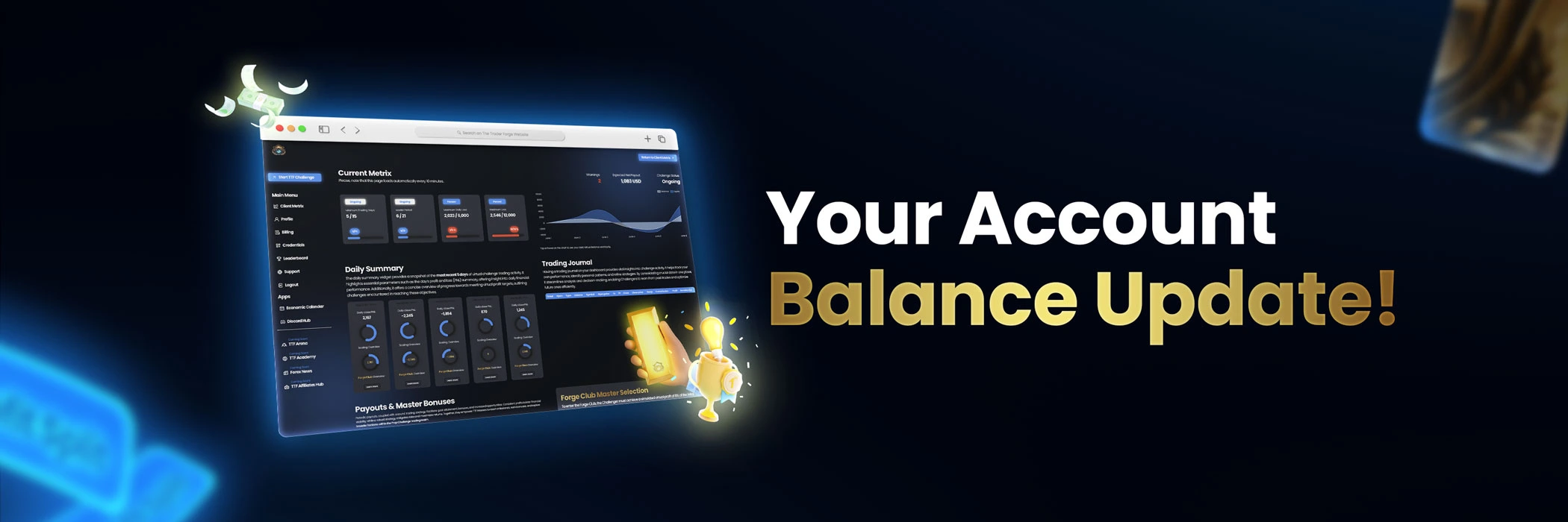
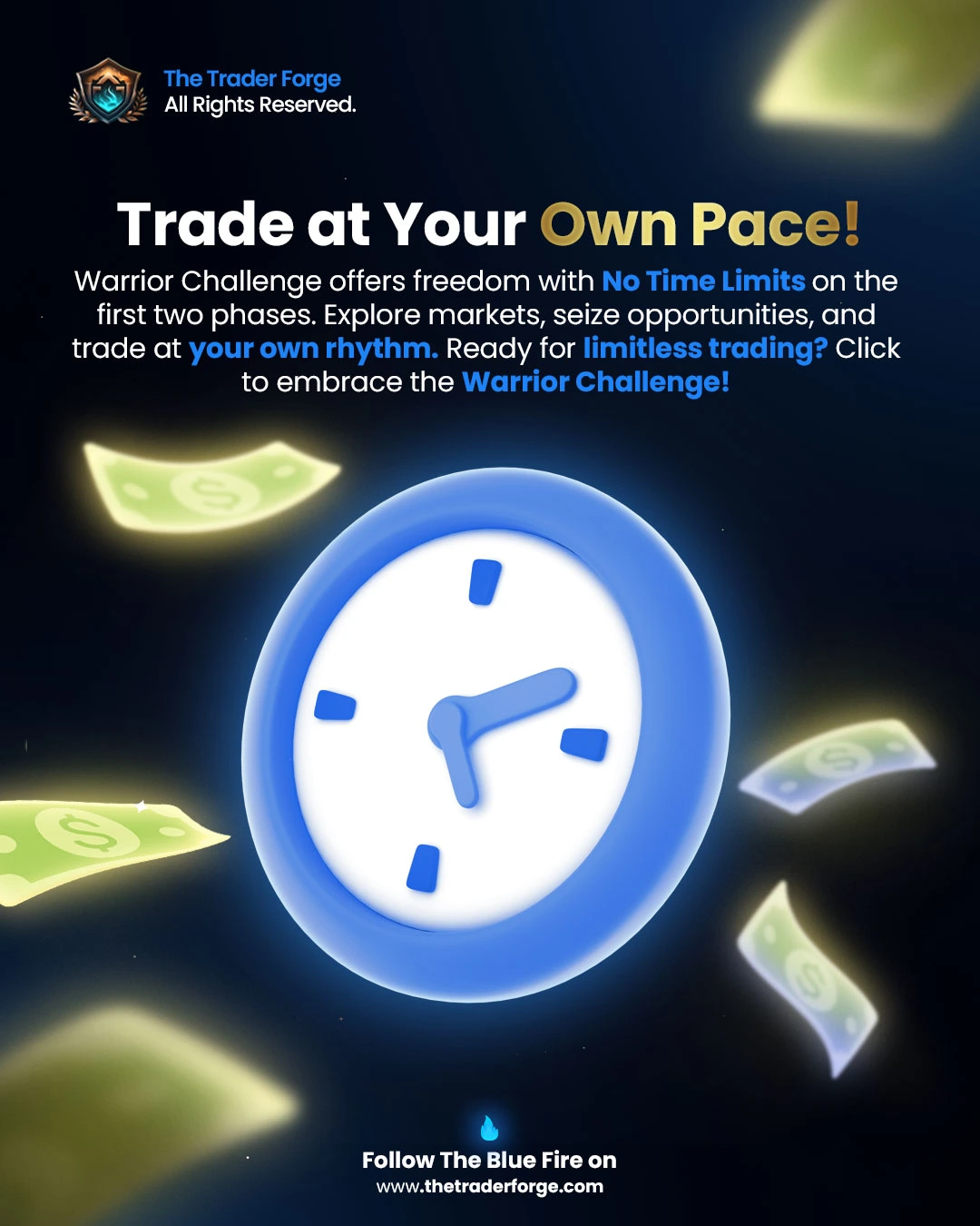
The Trader Forge is a forex trading company based in London, focused on traders who want to build skill with method and consistency. To stand out in a market crowded with generic promises, they needed a solid visual identity and social content that communicated authority from the first glance.
- Client
- The Trader Forge
- Industry
- Forex trading
- Services
- Branding and social media
- Location
- London, UK
Challenge
Building a brand that conveyed expertise and reliability in the forex world, moving away from the aggressive and less credible aesthetics typical of the sector, without losing visual impact on social channels.
Solution
We created the logo, visual identity and social media design with a precise, premium graphic language. Templates, palette and typographic hierarchies form a modular system designed to scale across posts, stories and campaigns while maintaining consistency and recognisability.
- 01Discovery
Briefing
Brand analysis
Roadmap
Moodboard
- 02Branding
Logo concept
Visual identity
Palette and typography
Brand guidelines
- 03Social media
Post templates
Story templates
Asset kit
Tone of voice
- 04Delivery
Final review
Asset export
Social formats
Handoff




Forex Aikido
- Branding
- Visual identity
- Social media
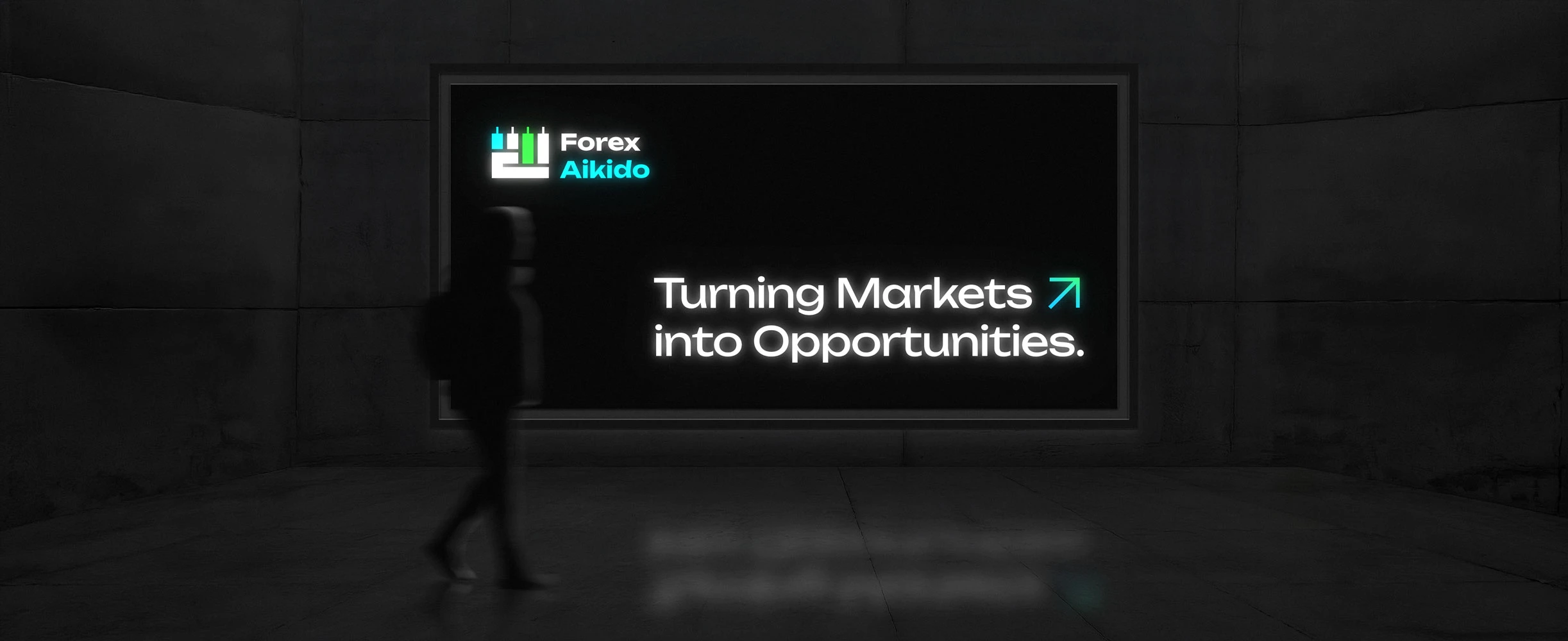
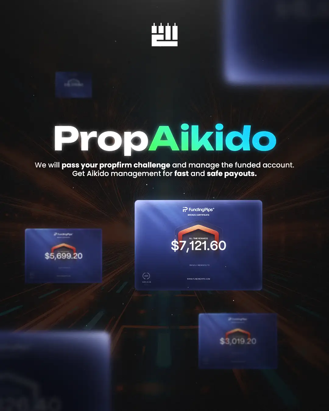
Forex Aikido is a forex trading company based in London, combining operational discipline and training for traders who want to navigate the markets with method. To stand out in a sector saturated with generic imagery, they needed a strong visual identity and social communication aligned with their positioning.
- Client
- Forex Aikido
- Industry
- Forex trading
- Services
- Branding and social media
- Location
- London, UK
Challenge
Translating a brand evoking control, precision and Eastern philosophy into a modern, credible visual system for the international financial market, avoiding trading-account clichés and building recognisability on social.
Solution
We developed the logo, visual identity and social media design from a distinctive concept combining rigour and character. Palette, typography and editorial templates build a coherent ecosystem ready to be applied across every communication touchpoint.
- 01Discovery
Briefing
Brand analysis
Roadmap
Moodboard
- 02Branding
Logo concept
Visual identity
Palette and typography
Brand guidelines
- 03Social media
Post templates
Story templates
Asset kit
Tone of voice
- 04Delivery
Final review
Asset export
Social formats
Handoff




Zenith
- Web design
- UX/UI design
- Copywriting
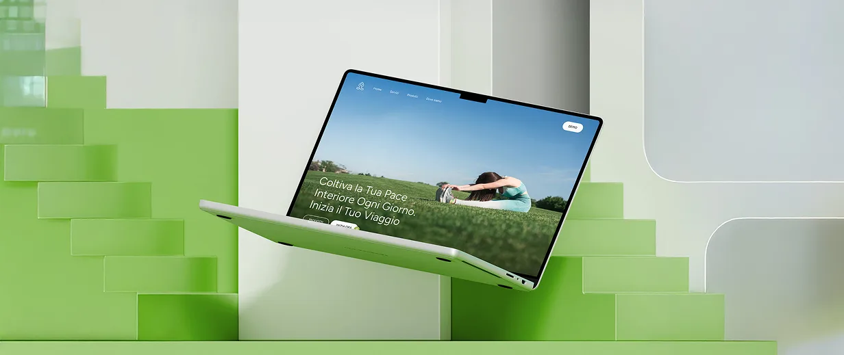
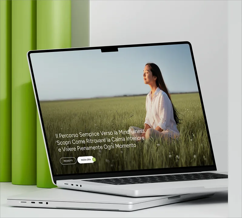
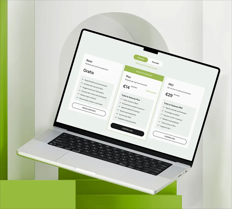
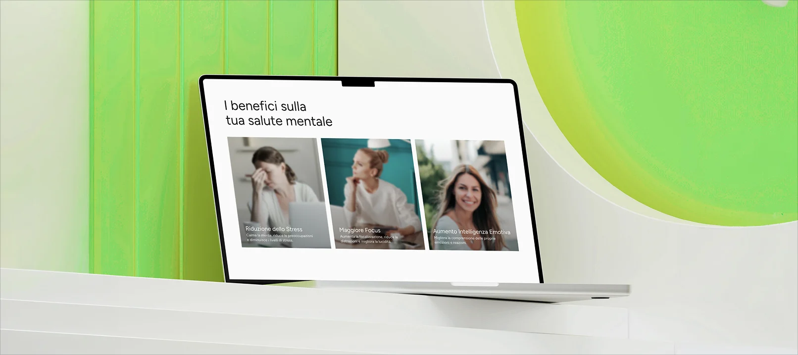
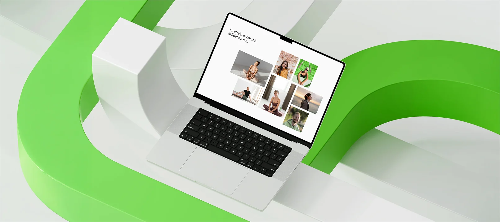
Zenith is an Italian app dedicated to mental wellness, with meditation and yoga paths designed for people who want to take care of themselves every day. They needed a website that communicated this philosophy with the same calm and clarity the product promises.
- Client
- Zenith
- Industry
- Wellness
- Services
- Web design
- Location
- Italy
Challenge
Translating onto a web page the inner experience a wellness app promises, in a crowded market where standing out requires a visual and narrative identity capable of conveying calm and trust at first glance.
Solution
We designed a website with an aesthetic aligned with the brand's values, a simple architecture and a tone that guides users toward downloading the app, letting the visual experience speak before the words.
- 01Discovery
Briefing
Brand analysis
Roadmap
Moodboard
- 02Strategy
Target definition
Content architecture
Wireframes
User flow
- 03Design
UI design
Components
Responsive
Visual identity
- 04Development
Development
Optimisation
Testing
Delivery
Borgo Sacro
- Web design
- UX/UI design
- Copywriting
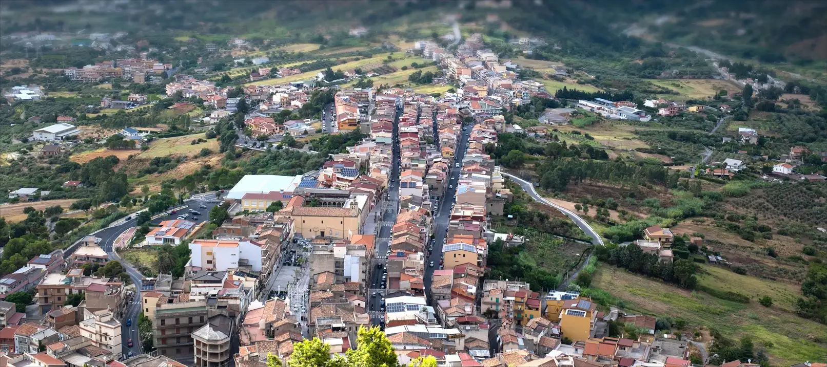
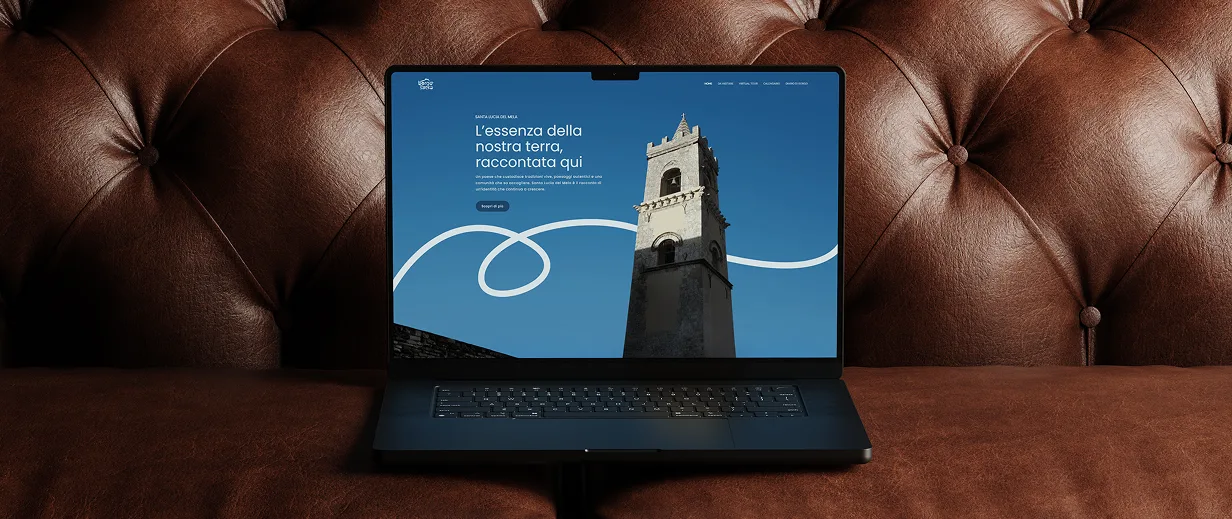
Borgo Sacro is a cultural and urban regeneration project funded through PNRR resources, aimed at enhancing the historic and religious heritage of Santa Lucia del Mela, a medieval village in the Peloritani mountains in the province of Messina. An ambitious initiative that needed a digital presence matching the scale of the project.
- Client
- Santa Lucia del Mela
- Industry
- Culture
- Services
- Web design
- Location
- Italy
Challenge
Telling a complex story online (history, art, urban regeneration and territorial development) in a clear and accessible way for diverse audiences, from tourists to institutions.
Solution
We redesigned the website with a narrative architecture that puts the village's heritage at the centre, guiding users through the project and the territory with a visual experience consistent with the historical richness of the place.
- 01Discovery
Briefing
Brand analysis
Roadmap
Moodboard
- 02Strategy
Target definition
Content architecture
Wireframes
User flow
- 03Design
UI design
Components
Responsive
Visual identity
- 04Development
Development
Optimisation
Testing
Delivery